
A Visual Journey
Across Editions of
 The Great
Gatsby
The Great
Gatsby
Framed by the Fictional Publisher Fathom Press
1925
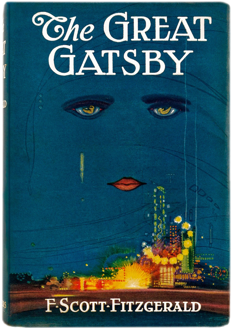
The Classic First Edition
- Publisher: Charles Scribner's Sons
- Artist: Francis Cugat
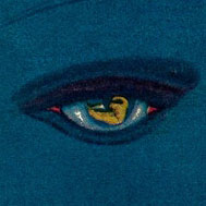
"A disembodied face floating above a glowing New York City skyline and lightscape."

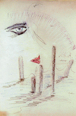
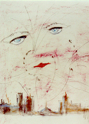 "Celestial Eyes" by Artist Francis Cugat w/ sketches
Though often read as reflections of Doctor T. J. Eckleburg or Daisy's “disembodied face,” the cover may have influenced the novel first, as Fitzgerald stated that he had “written it [the cover] into the book”. Cugat's early sketches already set a pair of celestial eyes above an ashen wasteland, suggesting a rare exchange where art and story shaped one another.

The title pairs a swashed “The” with rigid, engraved capitals, creating a visual hierarchy. Heavy serifs and uneven strokes suggest handcrafted nostalgia, while the all-caps treatment gives “GREAT GATSBY” monumental weight
Only the title and author sit above the “celestial eyes,” forming a minimal, classically traditional cover.
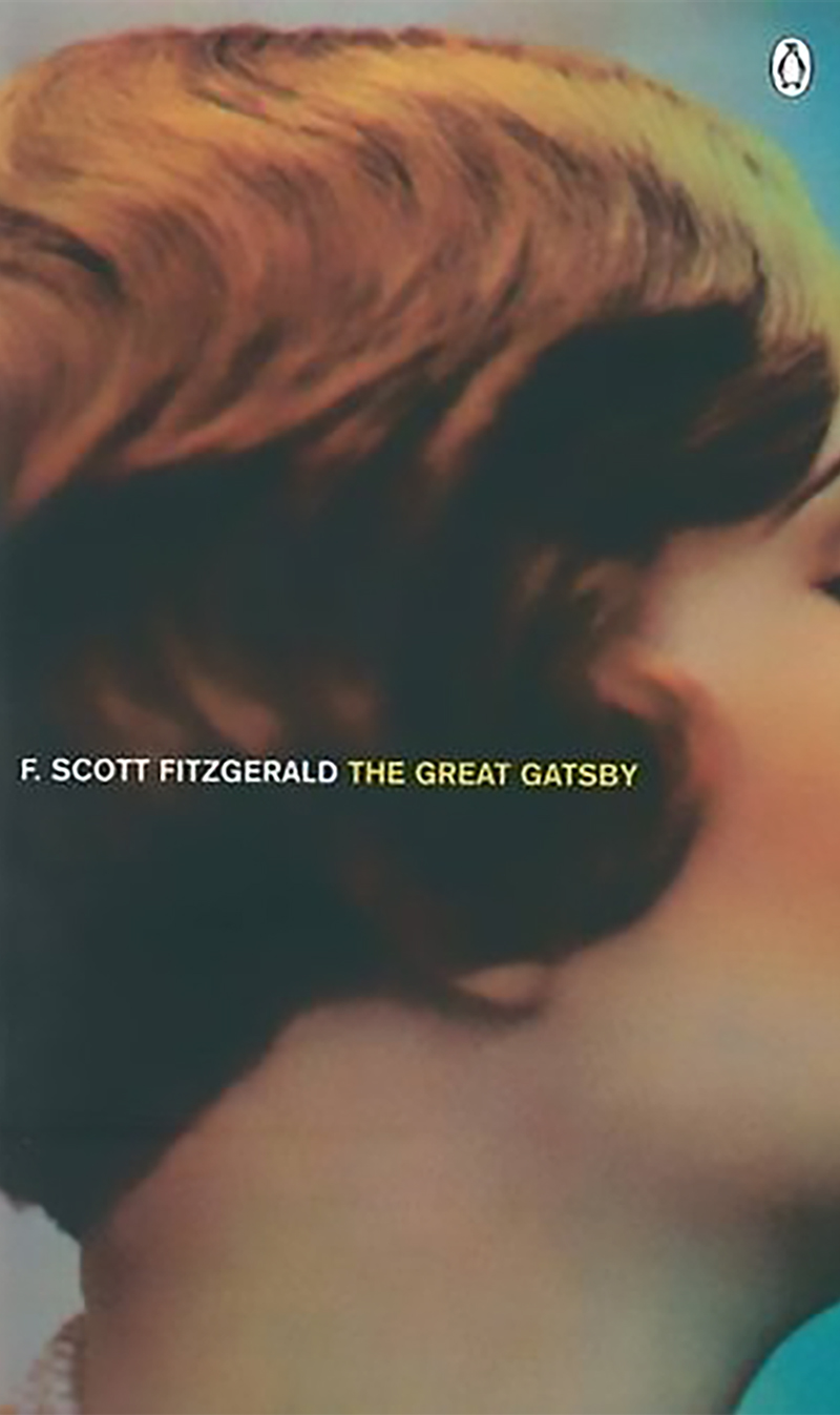
1998
Essential Penguin Paperback Edition
- Publisher: Penguin Books
"Daisy's face remains hidden, much like the way she remains obscured by Gatsby's longing in the novel. What the reader sees is not Daisy herself but the space she occupies as a symbol—an unreachable aspiration, a shimmering illusion at the center of Gatsby's dream."
The imagery has a cinematic realism, while the title and author appear on a single line in a small sans-serif, creating a minimal, contemporary presentation.
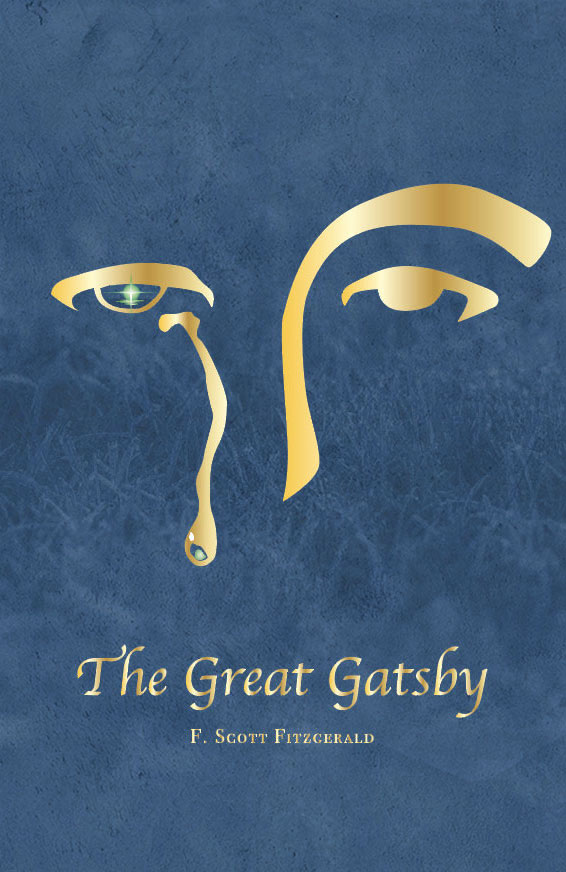
2025
Fathom Press Edition Cover
- Publisher: Fathom Press
- Designer: Shan Mei Kong
“I thought of Gatsby's wonder when he first picked out the green light at the end of Daisy's dock. He had come a long way to this blue lawn, and his dream must have seemed so close that he could hardly fail to grasp it.” (P.184, The Great Gatsby)


The title uses a high-contrast, calligraphic serif that conveys elegance and a sense of classic literary refinement.