1. Explored a renowned typeface family and established typographic brand consistency throughout the design
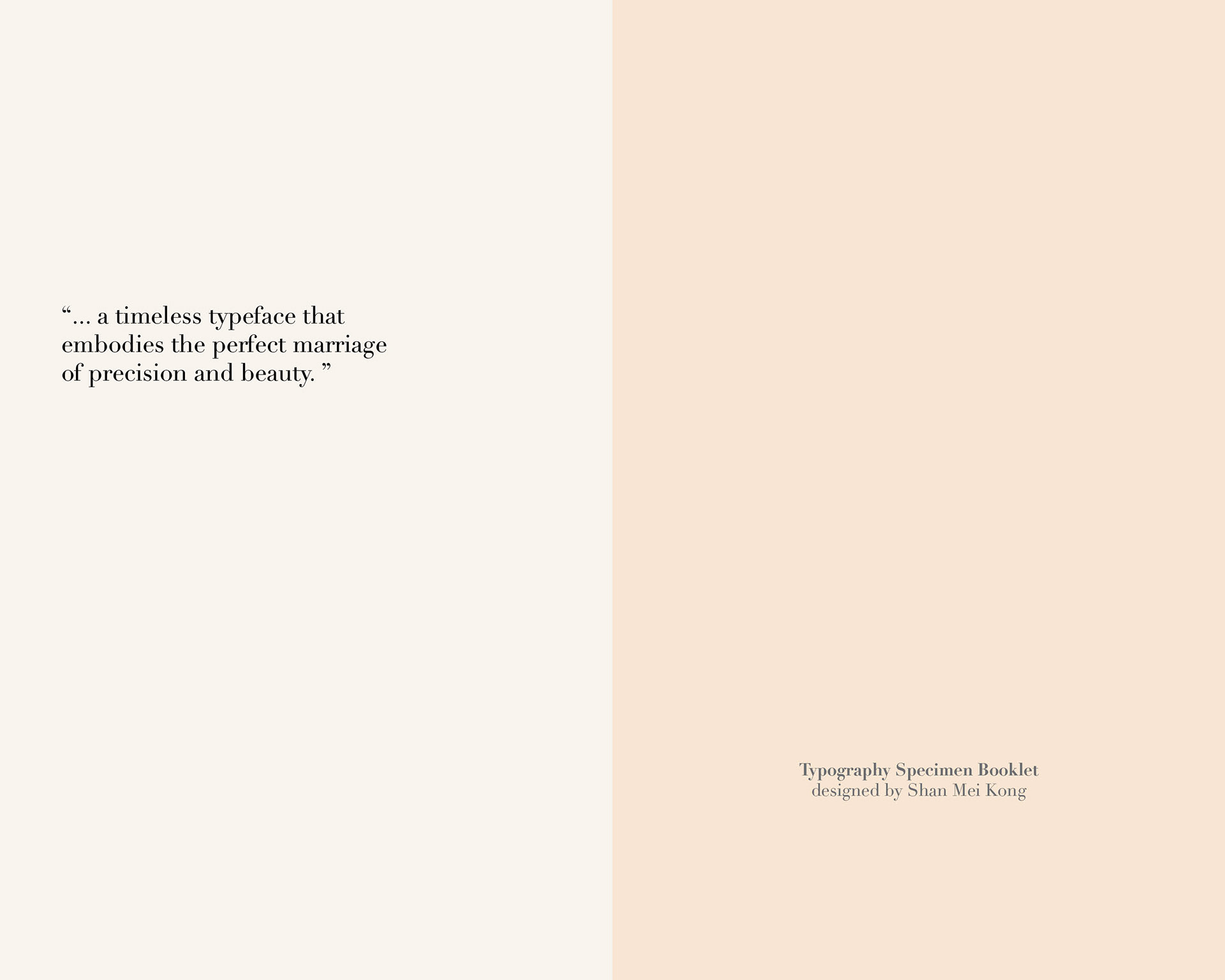
2. Structured editorial design for a 28-page typographic booklet, with a focus on minimal imagery
2. Structured editorial design for a 28-page typographic booklet, with a focus on minimal imagery
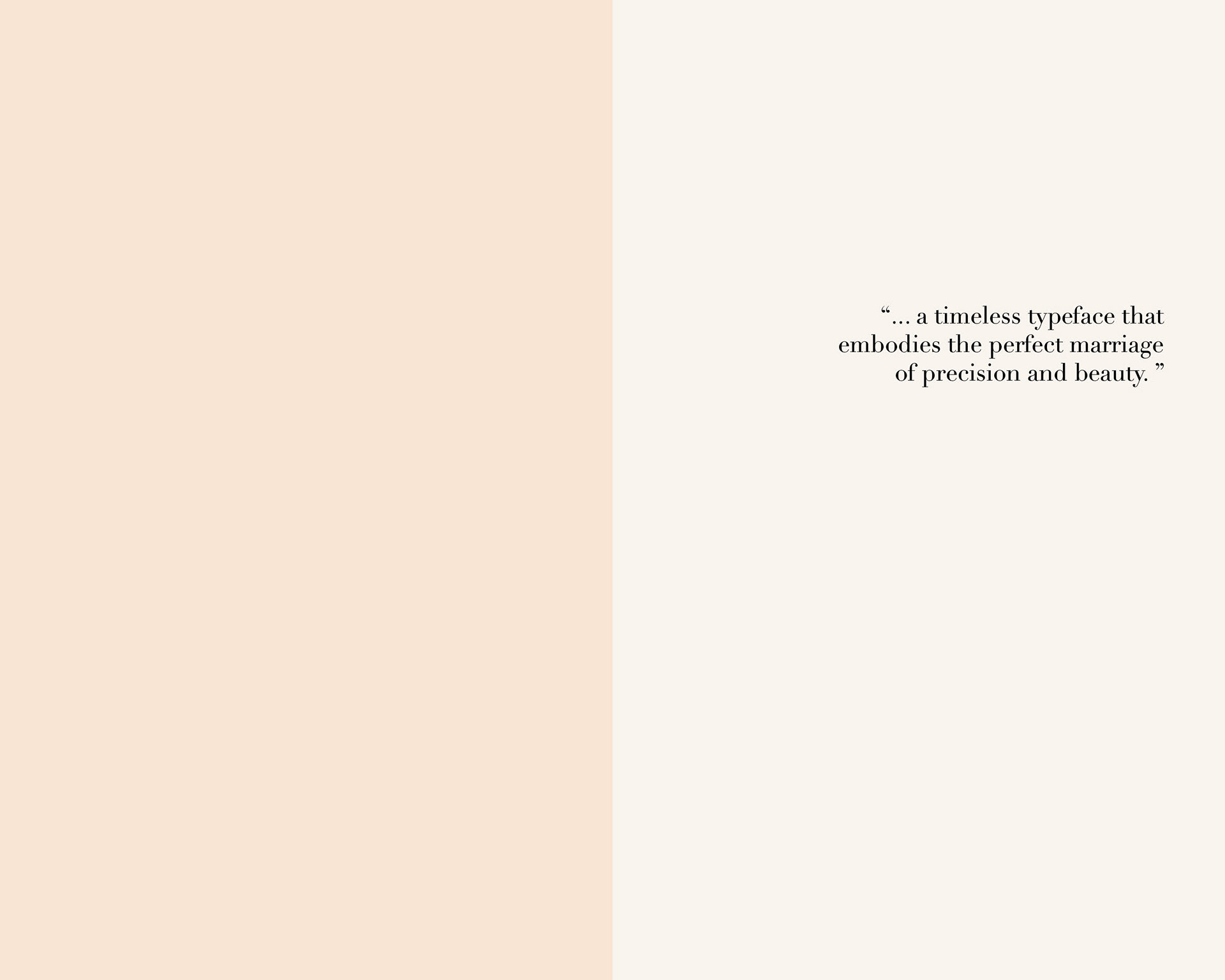
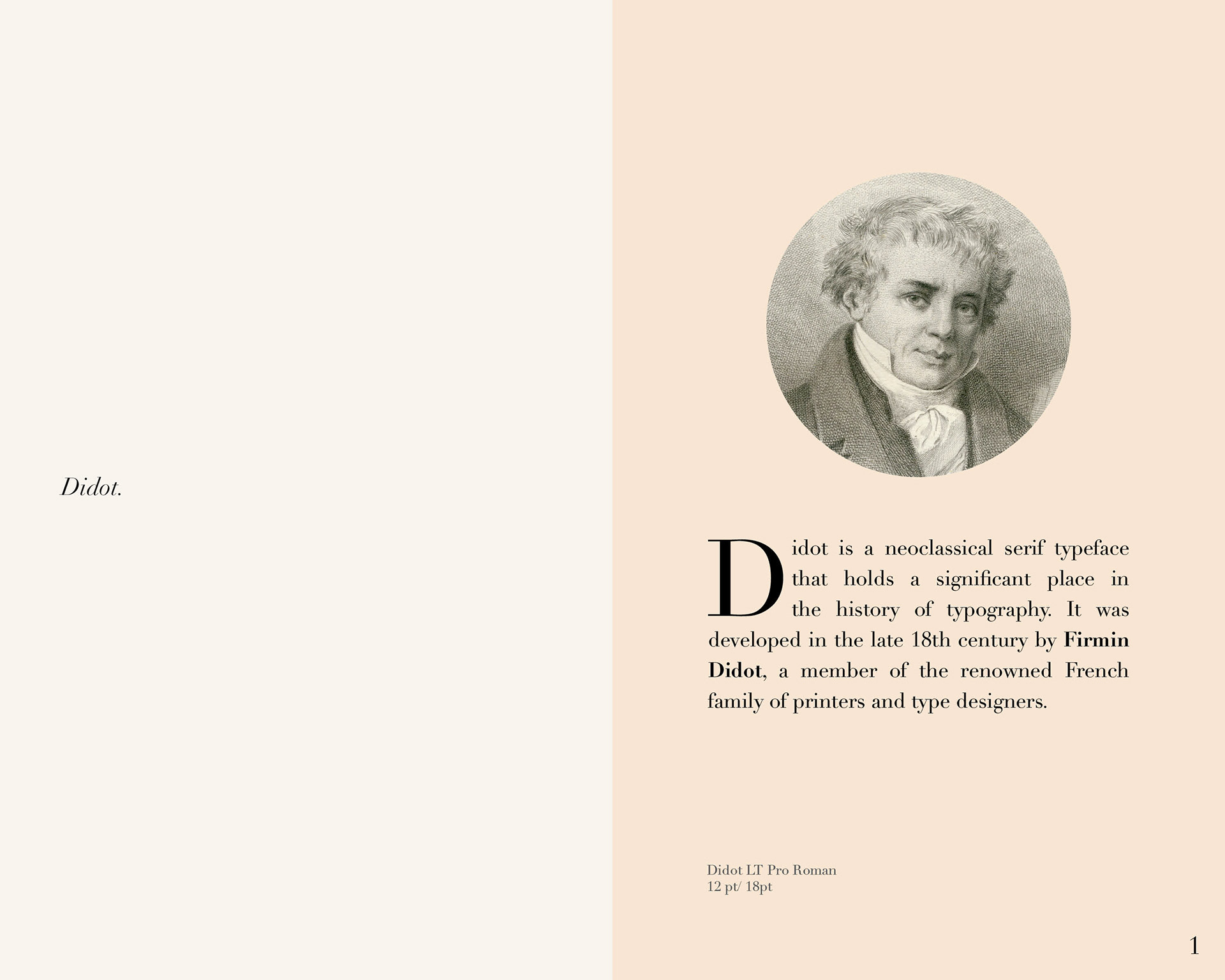
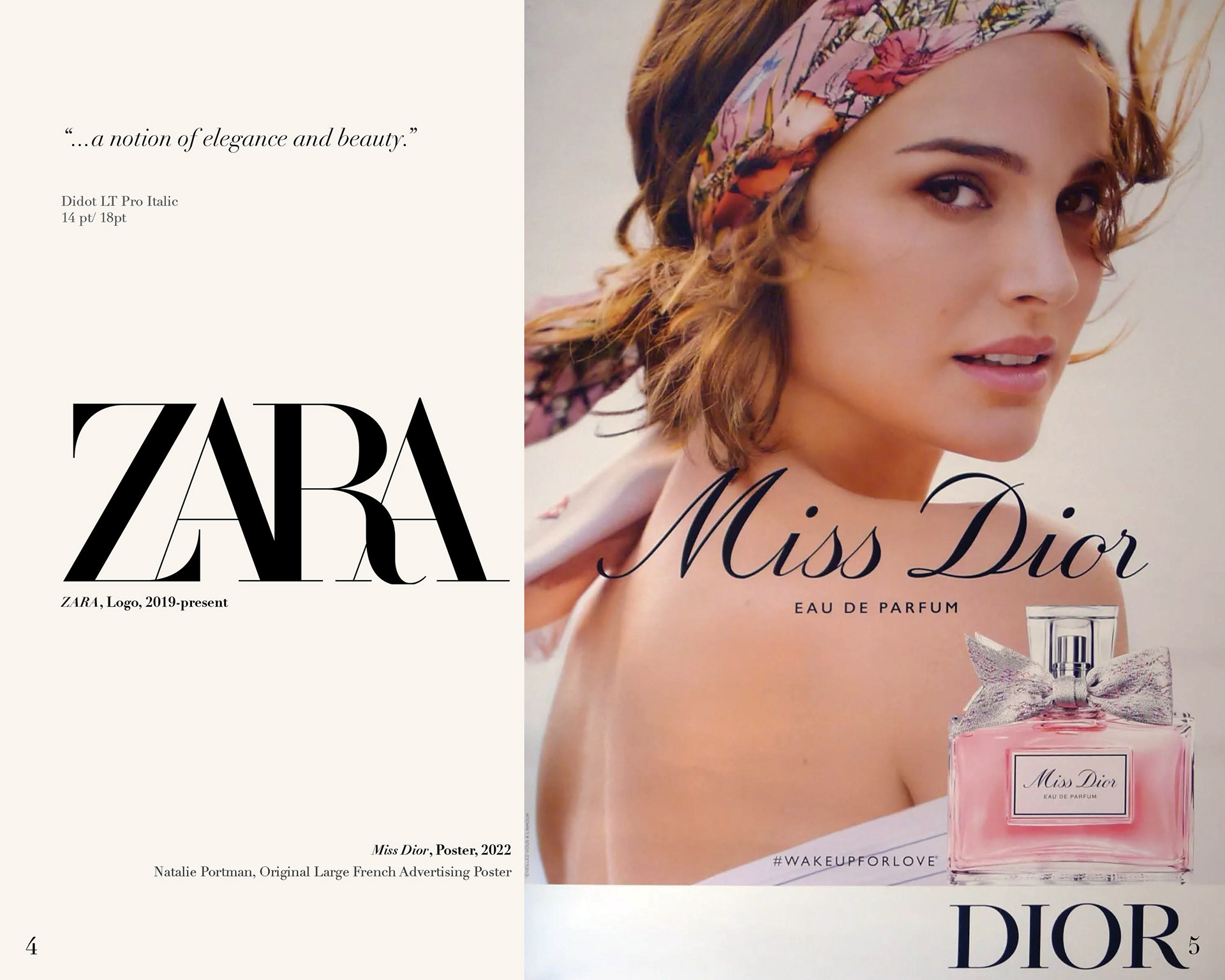
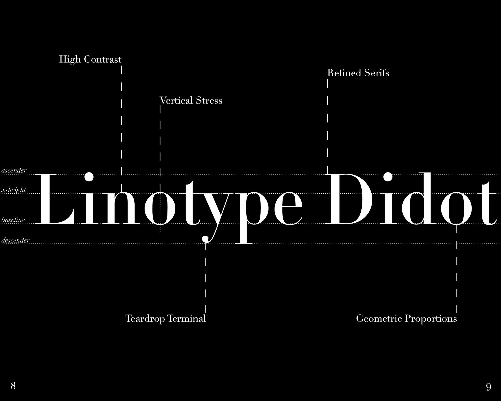
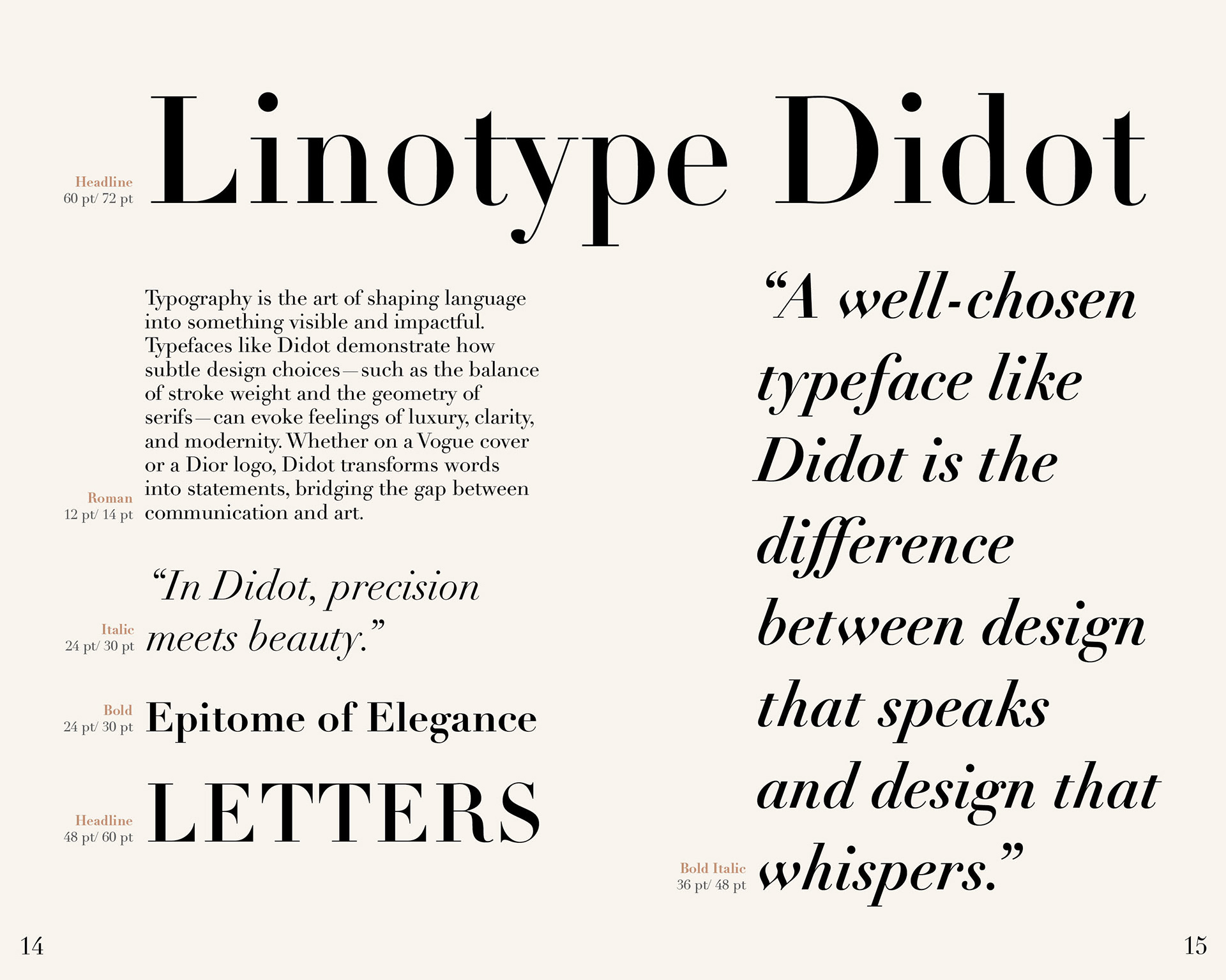
I conducted thorough research on several renowned typeface families and ultimately chose to focus on Didot. I then carried out more in-depth research on this specific typeface. Gaining a deeper understanding of Didot’s characteristics allowed me to identify three core brand identity keywords—“high-end,” “elegant,” and “refined”—which guided the overall design and tone of the booklet.
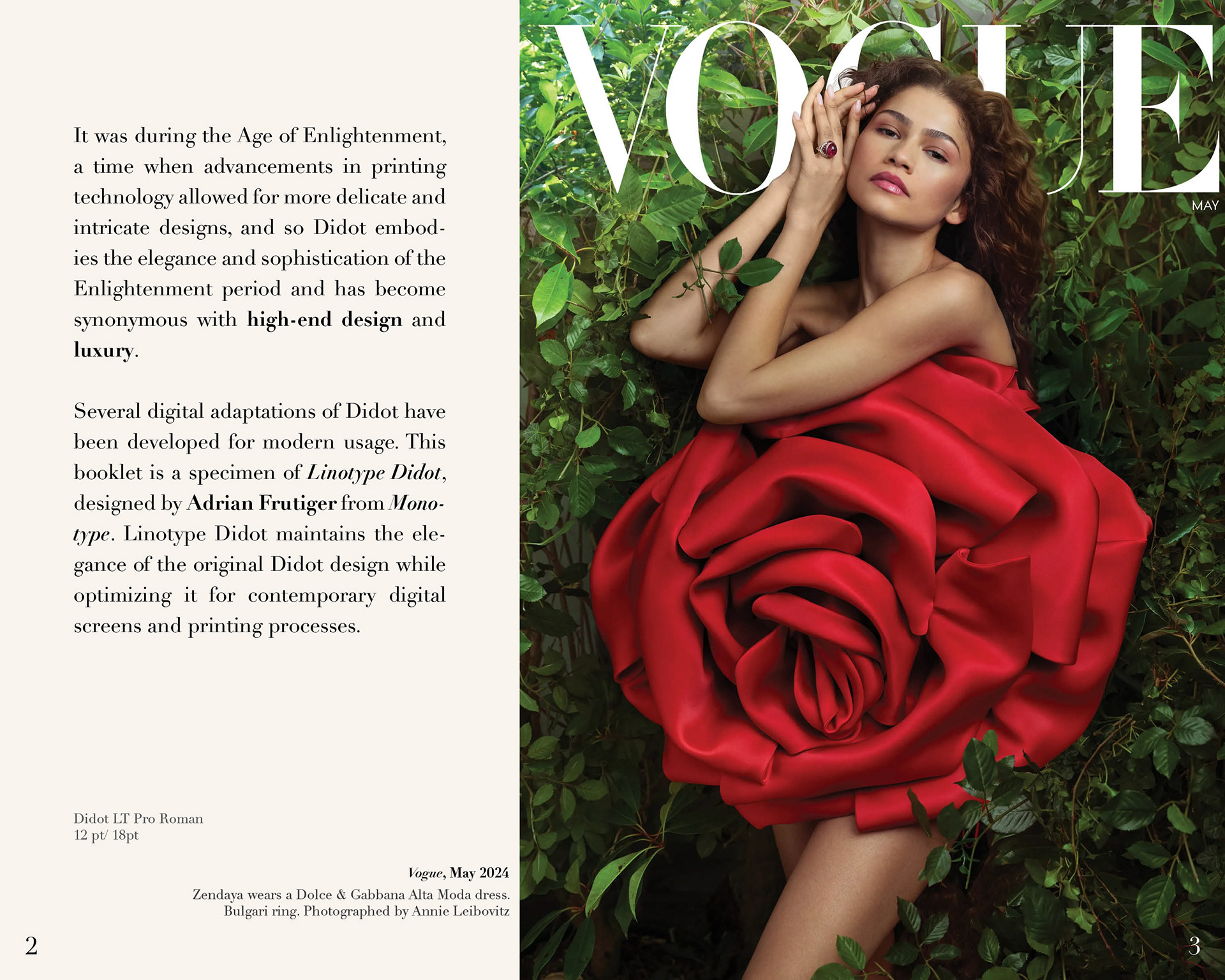
To express the elegance and cleanliness of Didot, I chose a calm, neutral color palette featuring tones like beige and linen for the background, paired with black and white for the typographic elements.
In the first version of the booklet cover, I placed a short, black title aligned to the right, with scattered Didot letterforms in the background to introduce a sense of depth and playfulness. However, I found that the background colors felt slightly off, and the scattered letters distracted from the main title.
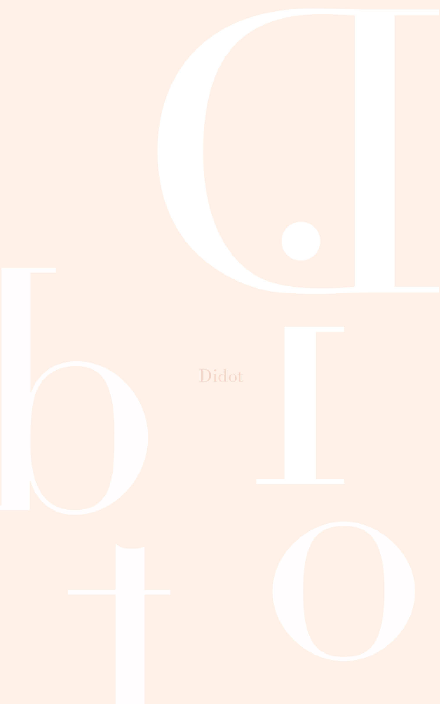
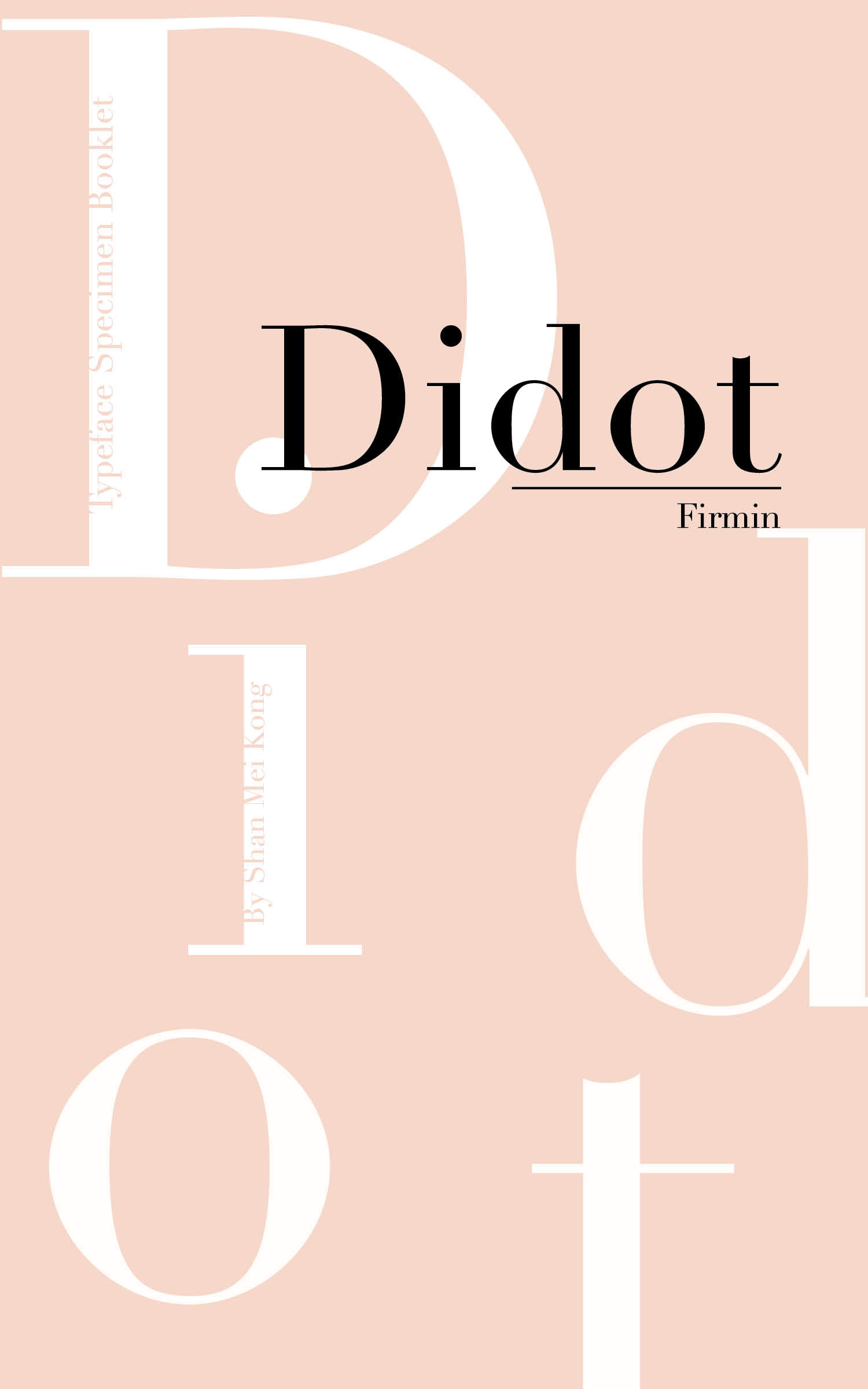
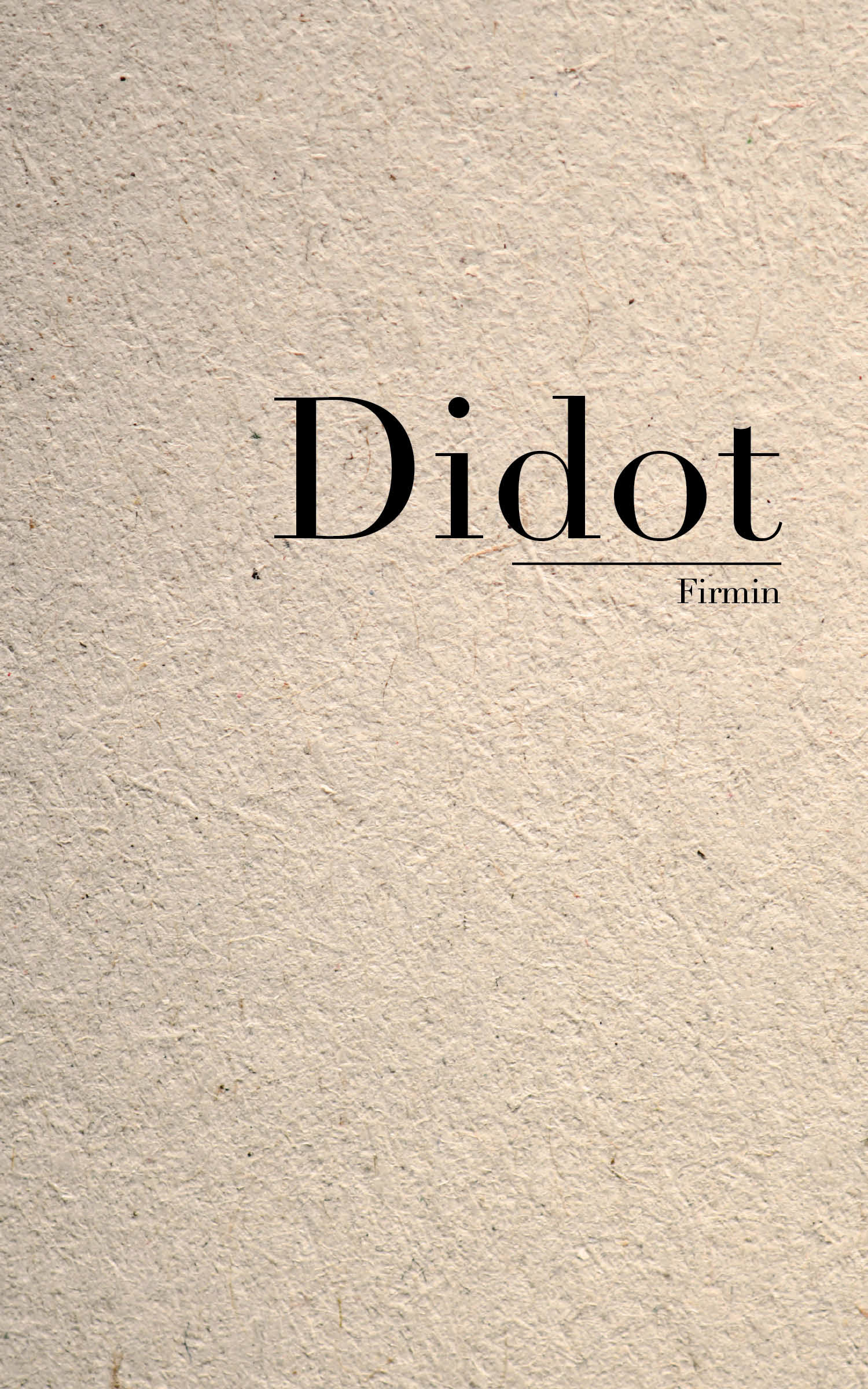
Then, I created a second version that preserved the title placement but featured a cleaner, more minimal background. I added a texture to the background to enhance visual interest.

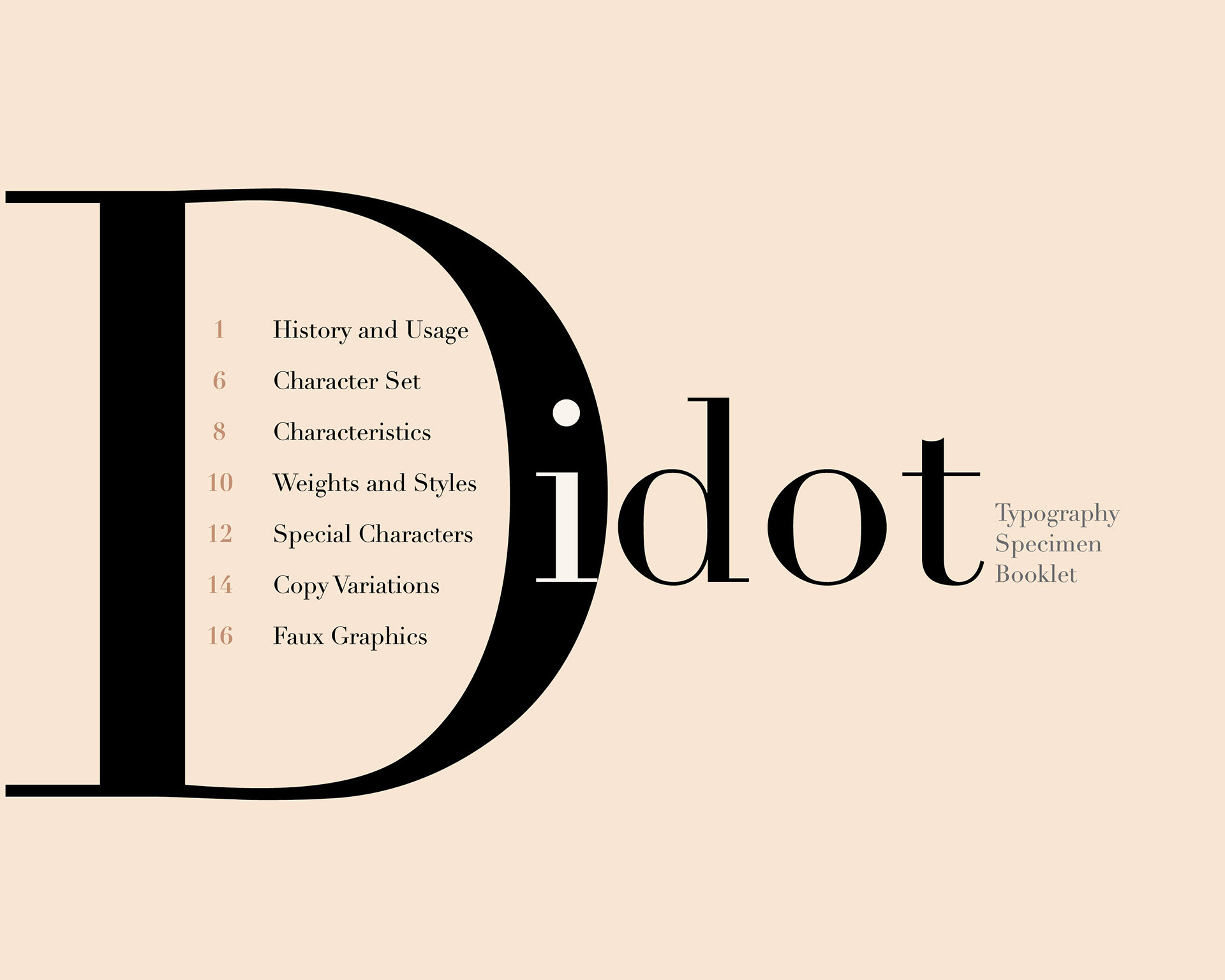
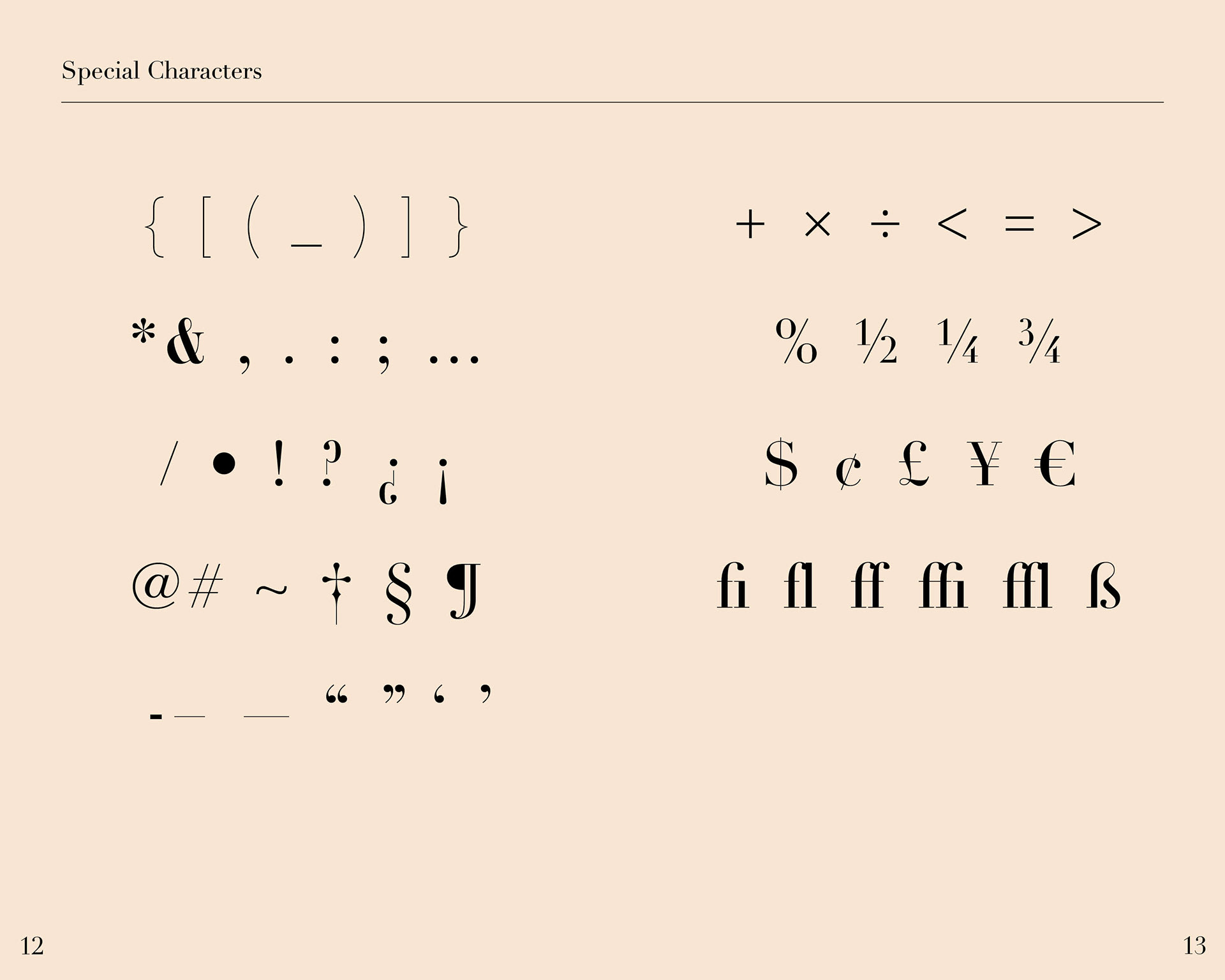
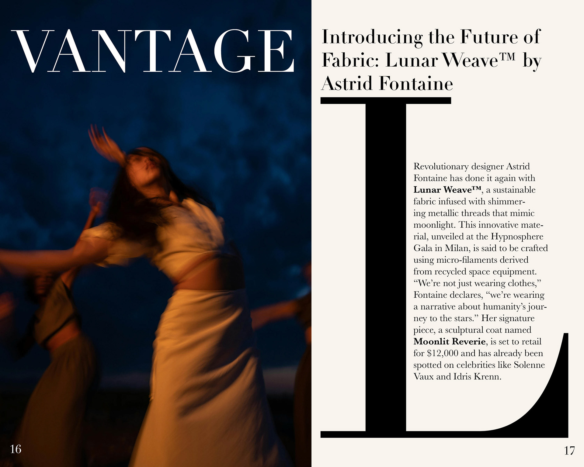
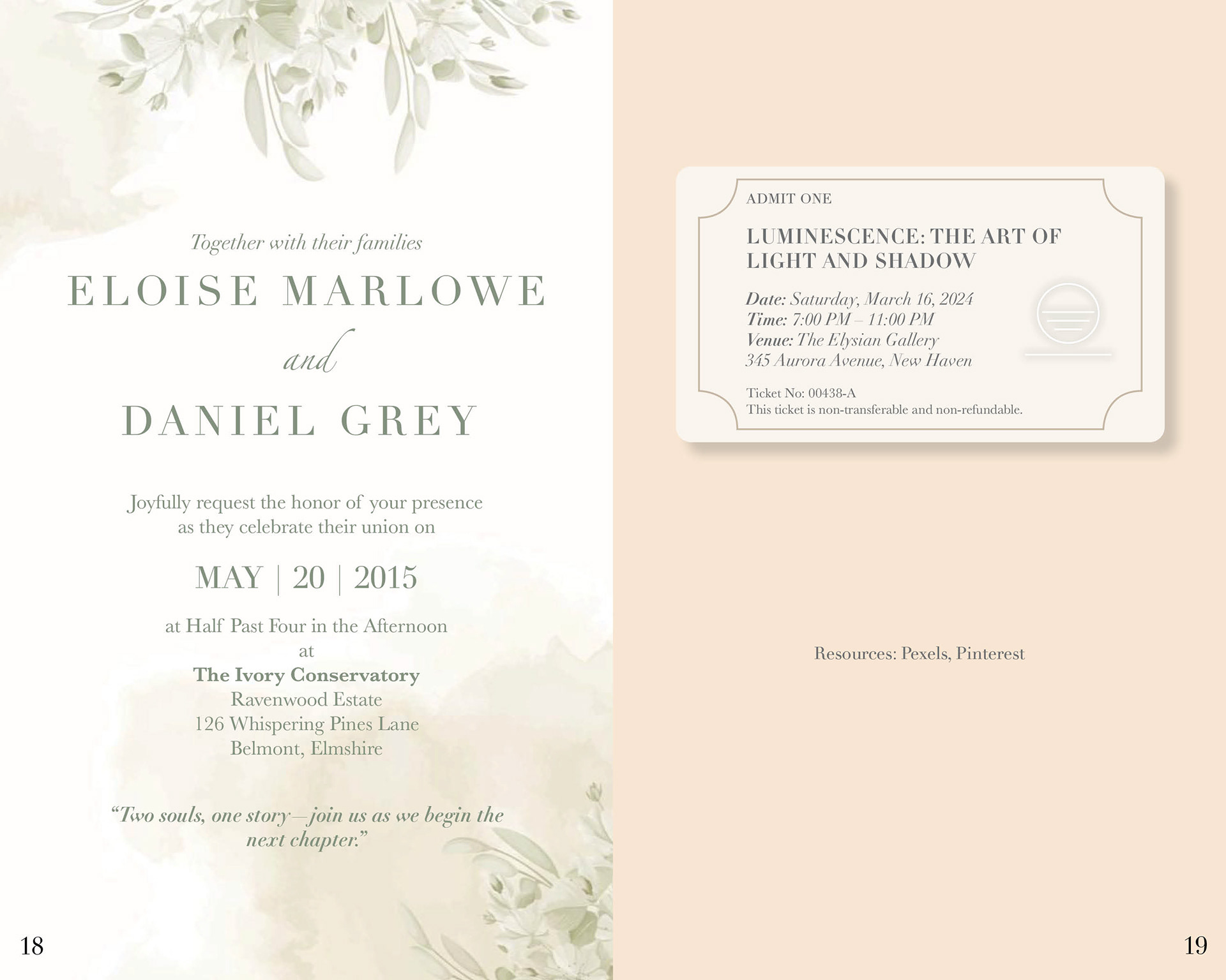
I went through several iterations of the content pages to refine both layout and concept. While Didot is a display typeface with delicate, high-contrast details, I chose to use large-scale letterforms throughout the design to highlight its elegance and sharpness. This approach can be seen across different layout variations, where I explored ways to balance aesthetic appeal with informative content.
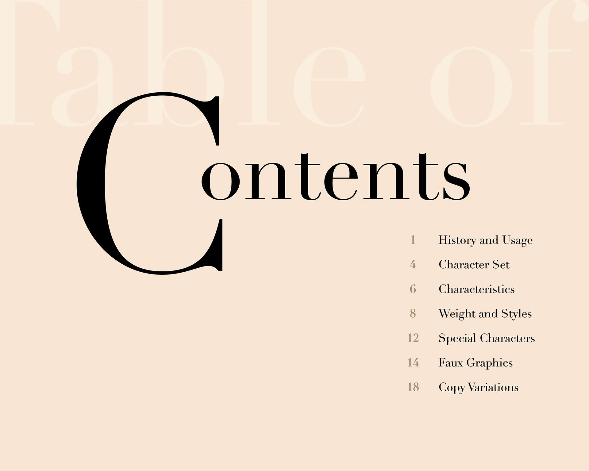
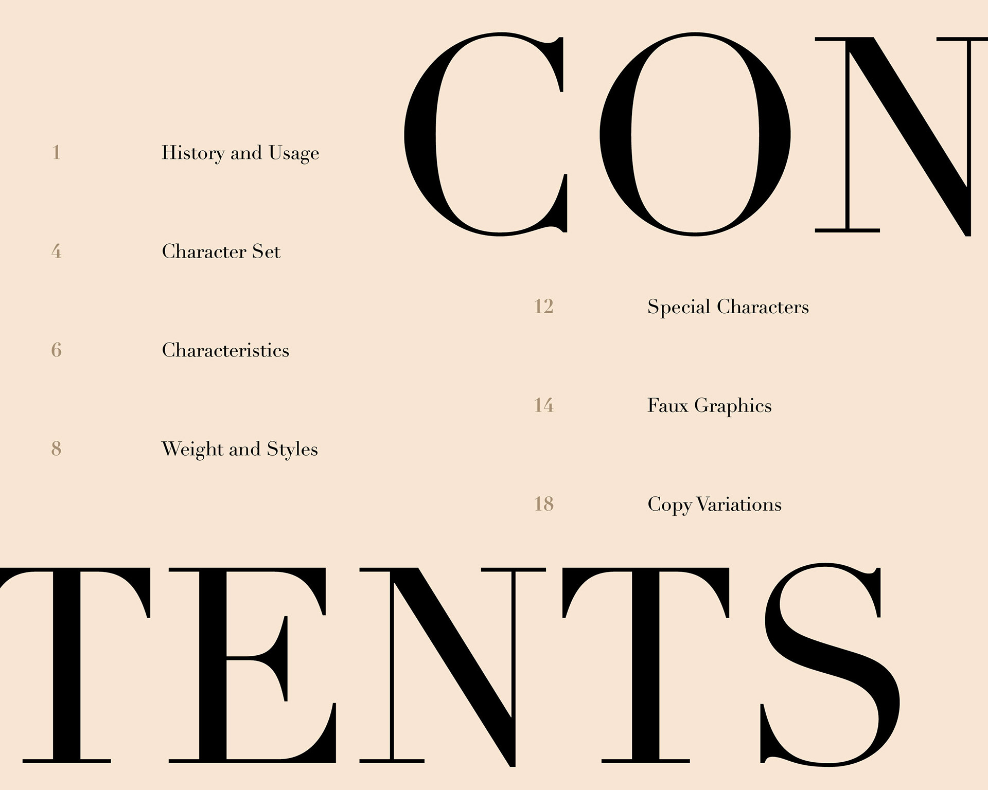
I selected the final version for its visual impact and thoughtful integration of form and function. The large-scale “D” creates a striking, stylized focal point that draws the viewer’s eye, while the nested table of contents placed within the shape adds both structure and intrigue. Additionally, the overlapping of a white “i” within the stroke of “D” introduces a playful contrast that serves as a subtle yet effective highlight.

Throughout the booklet, I focused on establishing a clear visual hierarchy and maintaining typographic brand consistency. At the same time, I incorporated small, intentional moments of contrast that break from the grid—adding rhythm, freshness, and a touch of surprise to the overall experience.