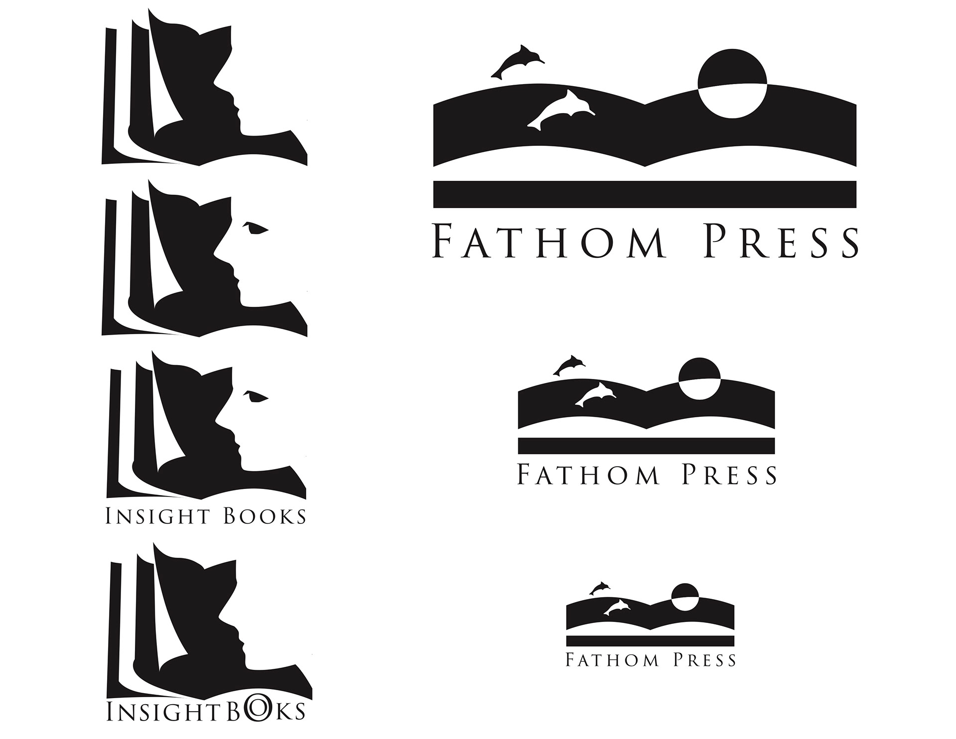
1. Design a logo for your own imaginary publisher
2. Design, print, and prototype a book jacket for one of the assigned books
2. Design, print, and prototype a book jacket for one of the assigned books
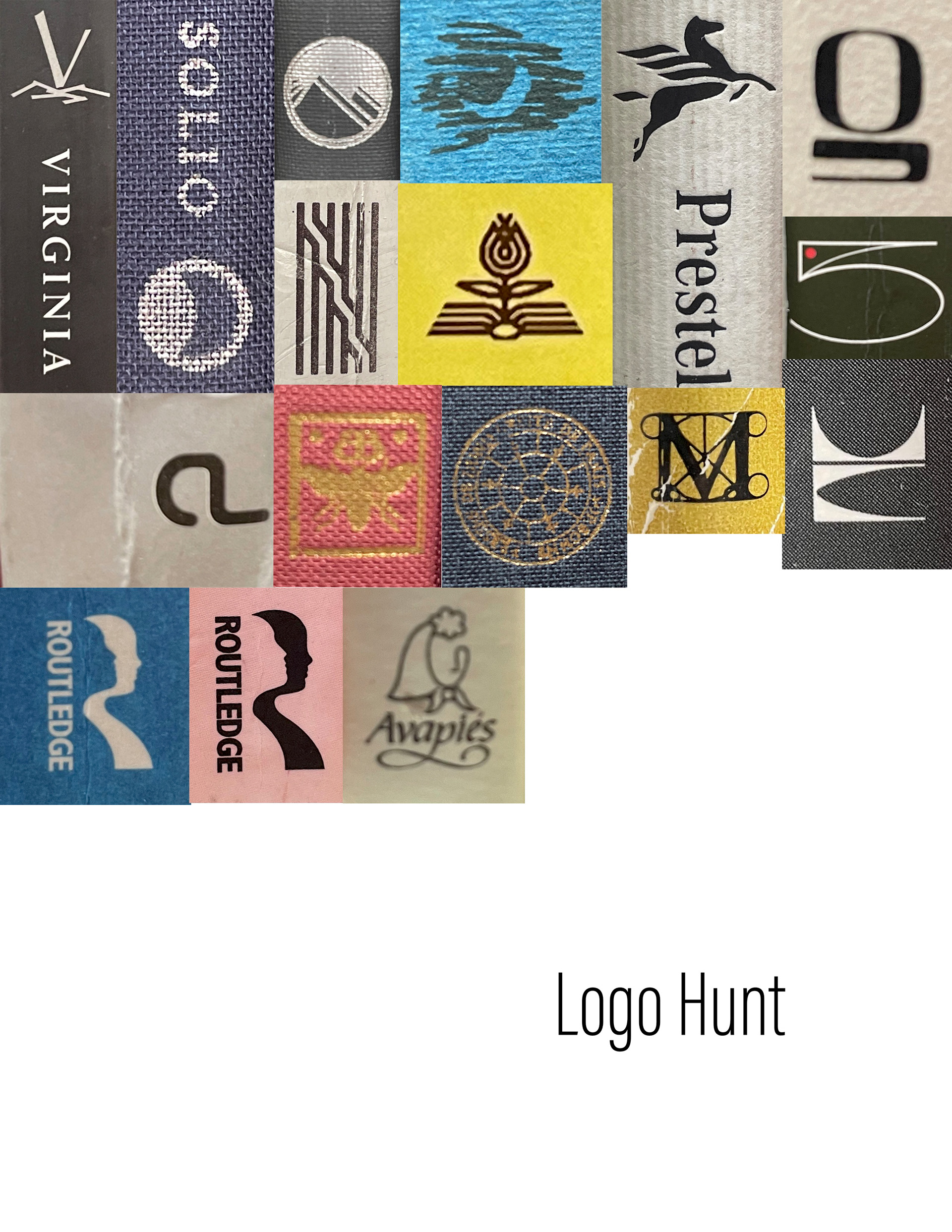
Before starting the design of the book jacket, I went on a logo hunt in the Binghamton University Library for inspiration. From that, I developed two potential logo concepts for my imaginary publisher. Finally, I decided to move forward with the "Fathom Press" logo.
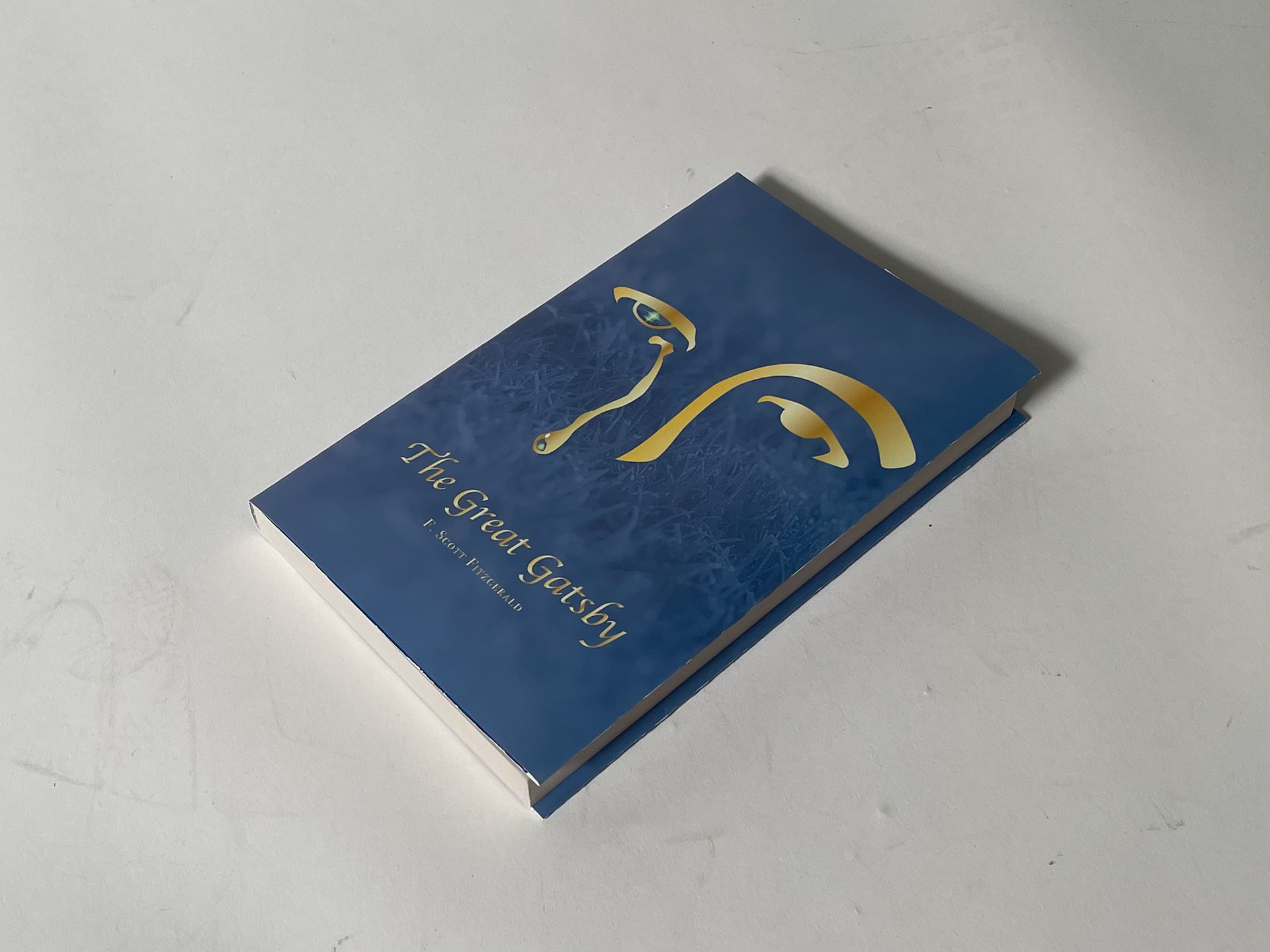
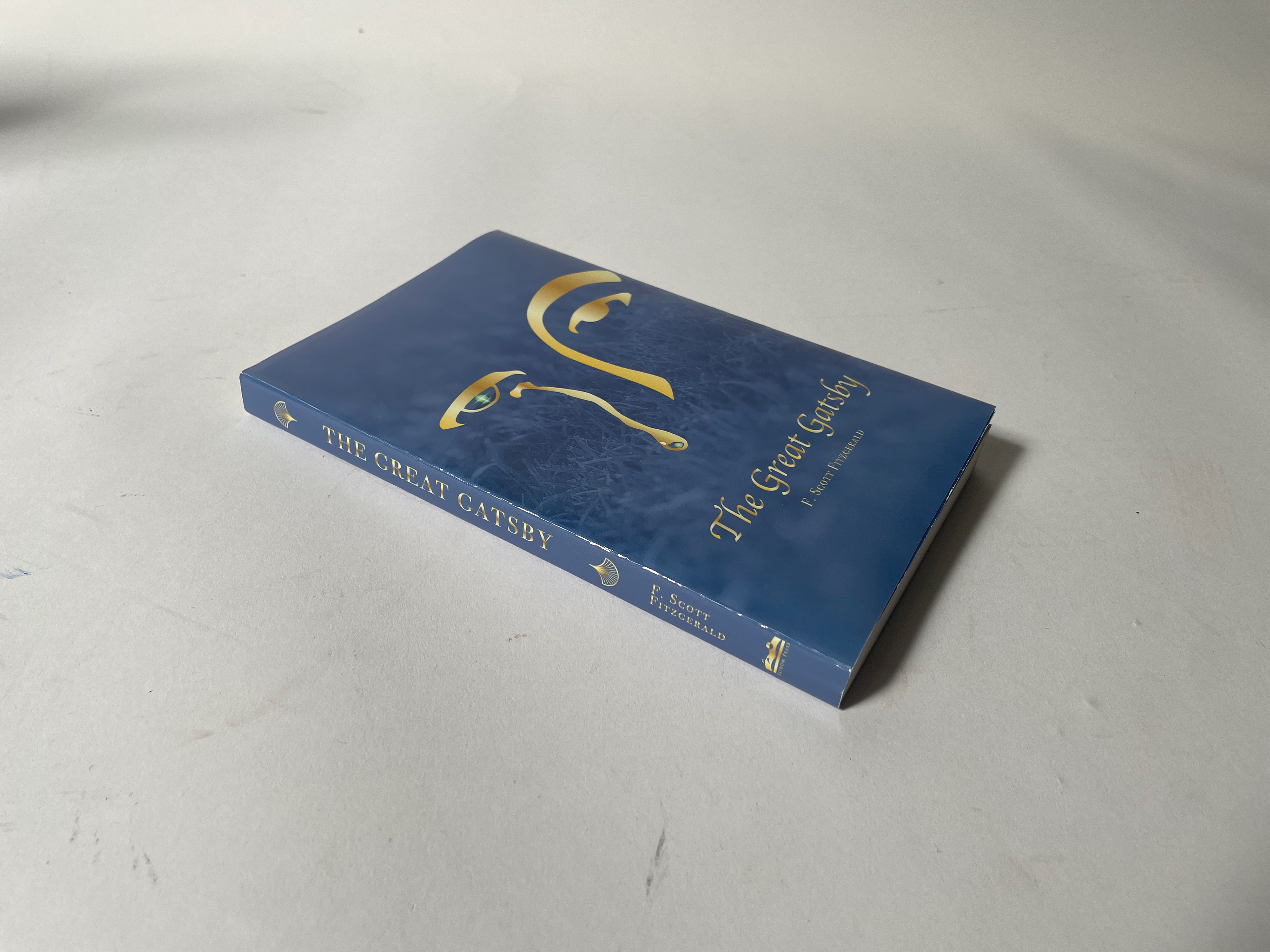
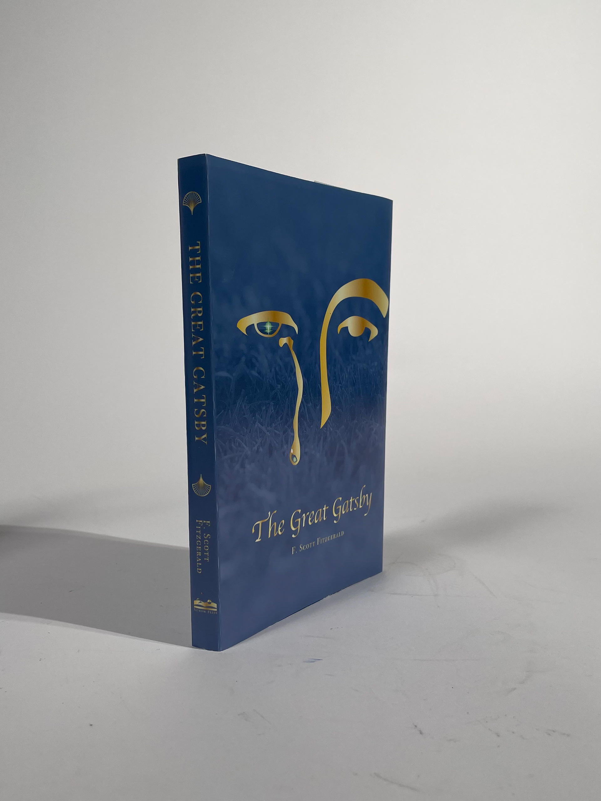
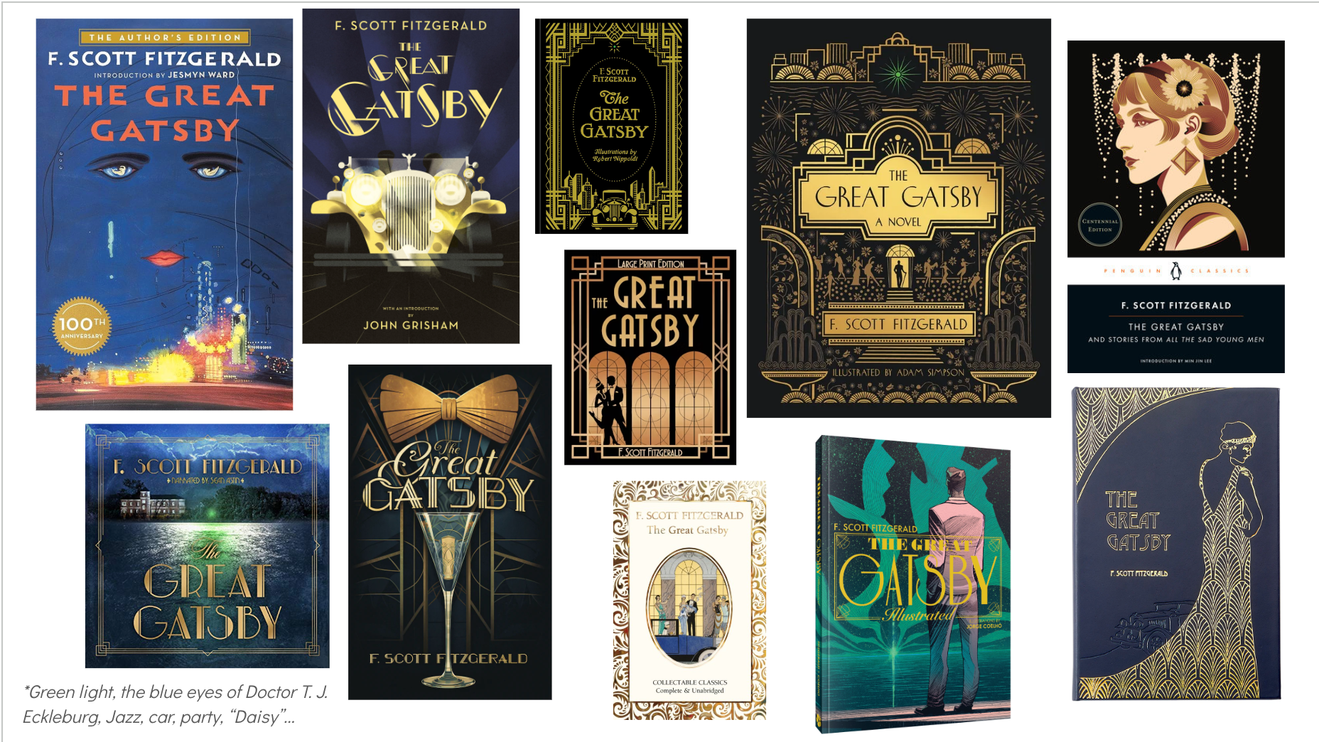
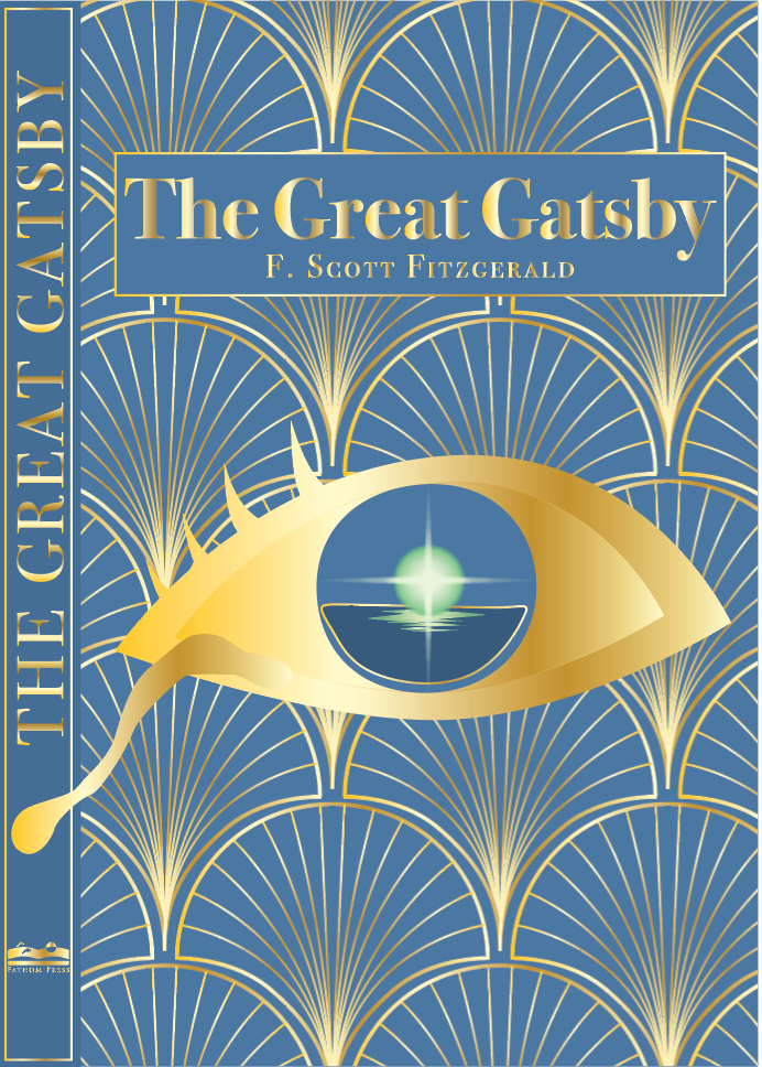
My project is a book jacket design for The Great Gatsby. After reading the novel, I highlighted beautiful and significant quotes that I felt captured the core themes of the story. They further served as the foundation of my design. During the visual research phase, I drew inspiration from past Gatsby covers and symbolic elements such as the green light, the Golden Jazz Age, etc.
Visual Research of "The Great Gatsby"
I began by sketching three initial ideas for the cover.
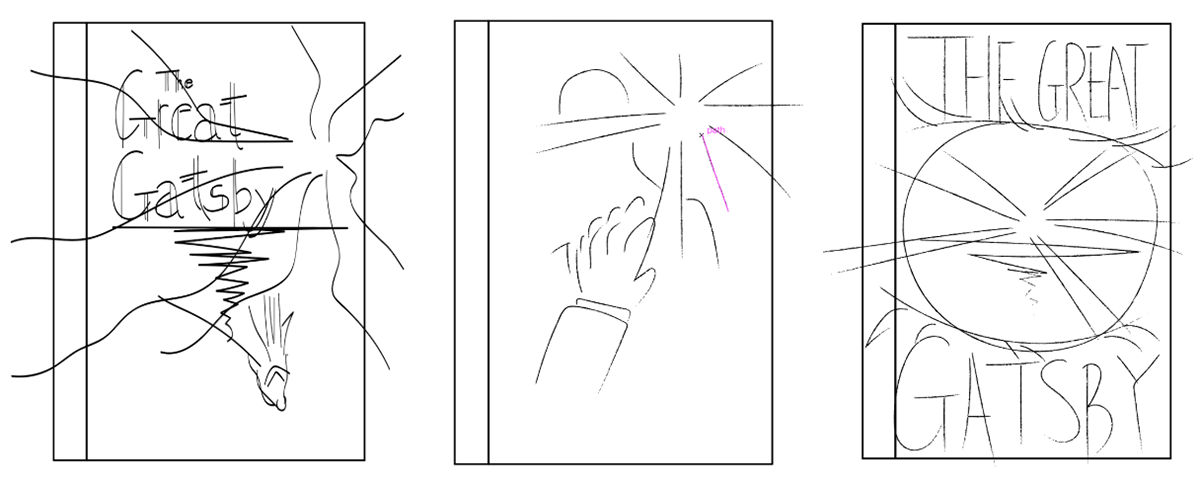
Sketches for three directions
Exploratory attempt 1
Exploratory attempt 2

Exploratory attempt 3
I chose to develop the third idea further: a close-up of Gatsby’s eye reflecting the green light. I was drawn to this subtle visual metaphor for Gatsby’s obsessive pursuit of the dream represented by the green light.


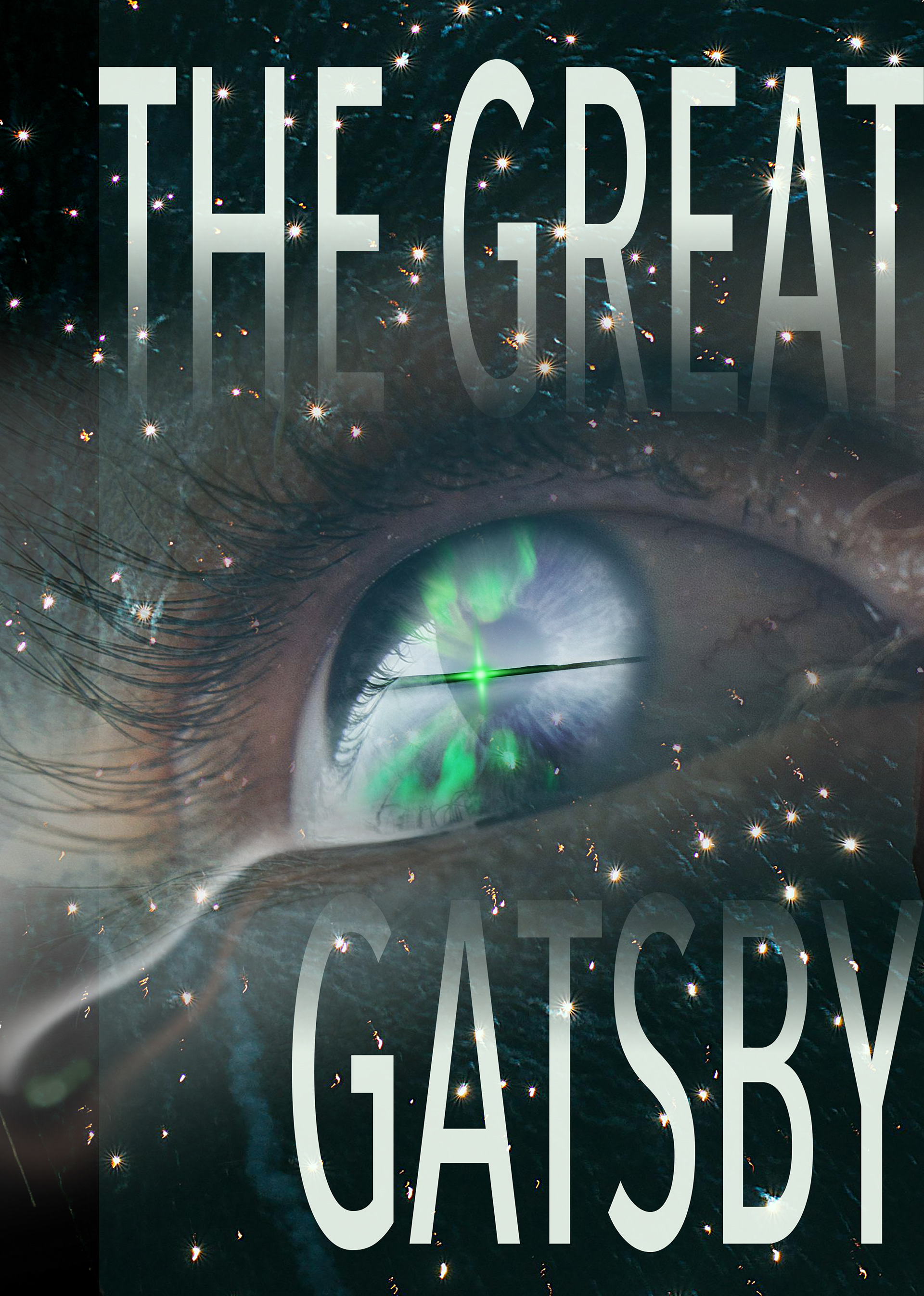
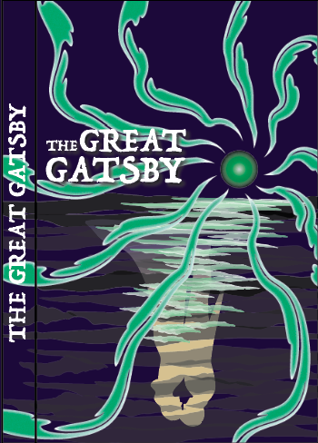
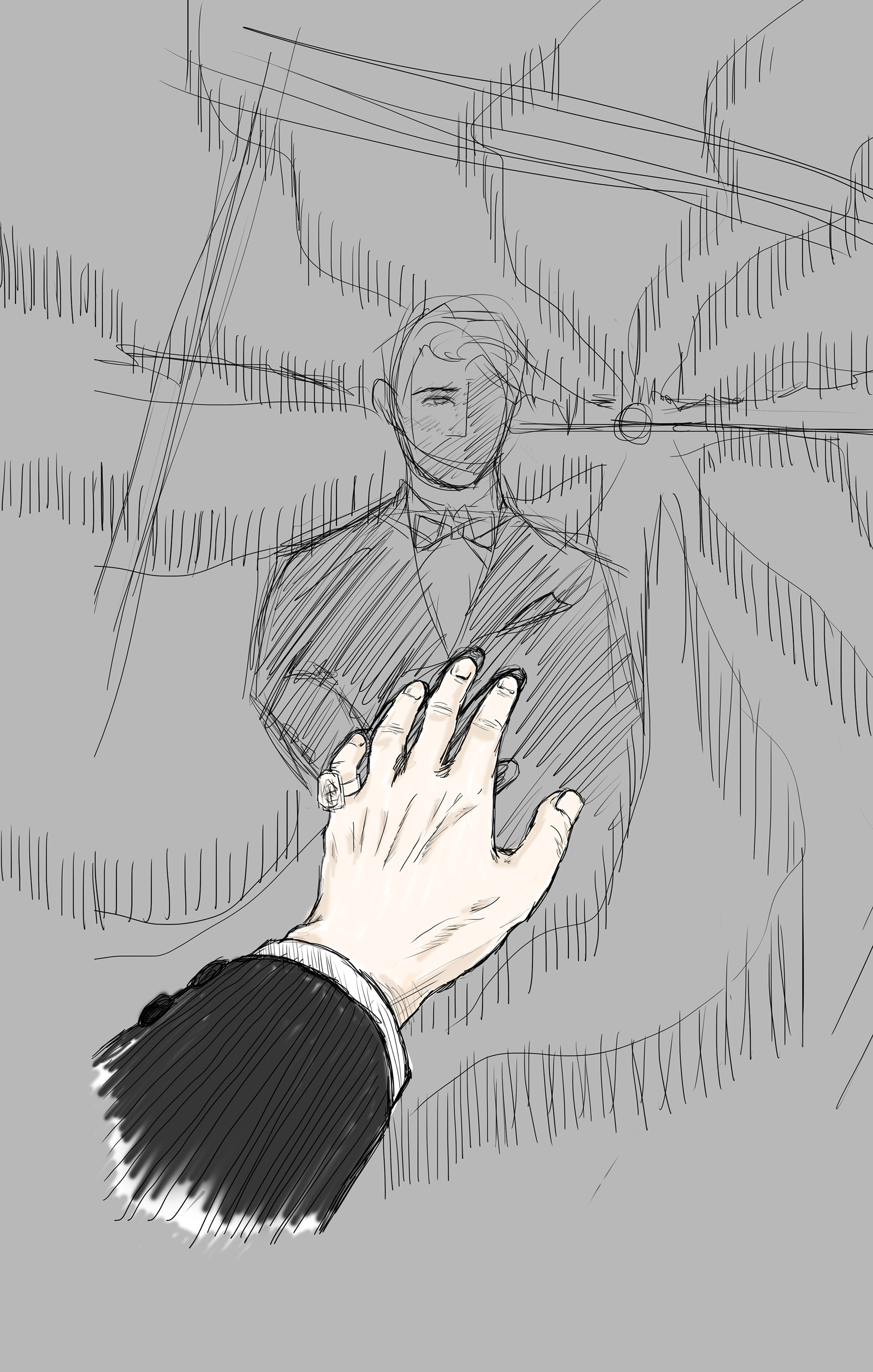
For the first round of iterations, I used Photoshop to create a photographic-style composite, but I found the modern, realistic style didn’t align with my impressions of Gatsby. I then switched to Illustrator and retried in a different approach.
I realized that having a single eye for the book felt visually awkward, so I chose to zoom out to reveal the upper half of Gatsby’s face in silhouette, maintaining the green light reflection in one eye.
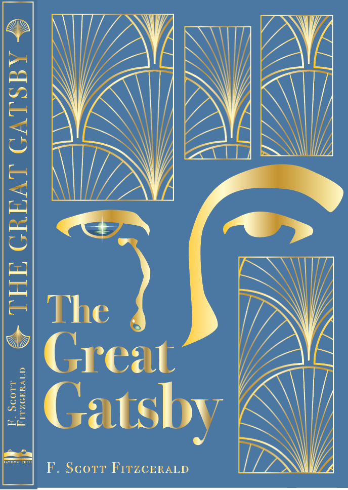
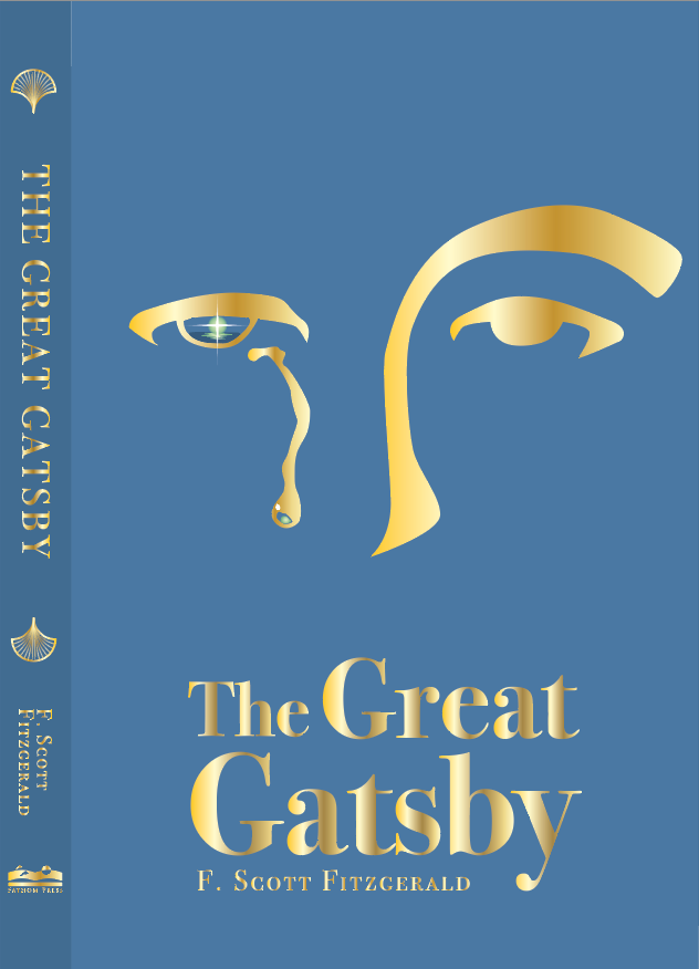
I like the “half face” silhouette solution because it connects visually and conceptually: the front cover becomes Gatsby’s face, and opening the book feels like unfolding his story. In this round of iterations, I decided to get rid of the golden pattern, which I initially wanted to symbolize the Jazz Age. I found out that it was not a meaningful design choice.
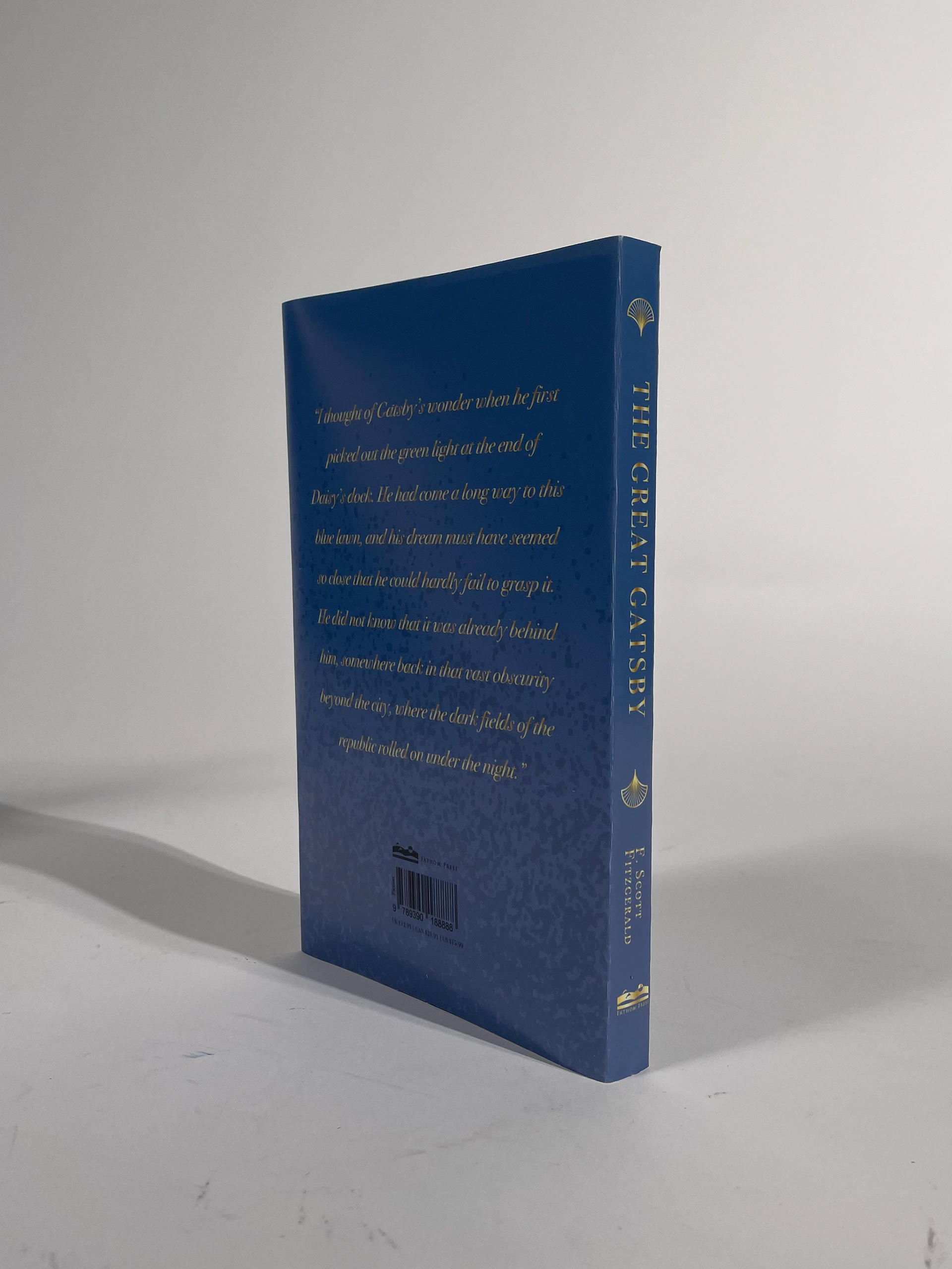
The primary color of the jacket is a deep blue, inspired by the classic edition of The Great Gatsby. Blue, often associated with wealth and depth, pairs elegantly with gold—my secondary color—to evoke the luxury and extravagance of the Jazz Age.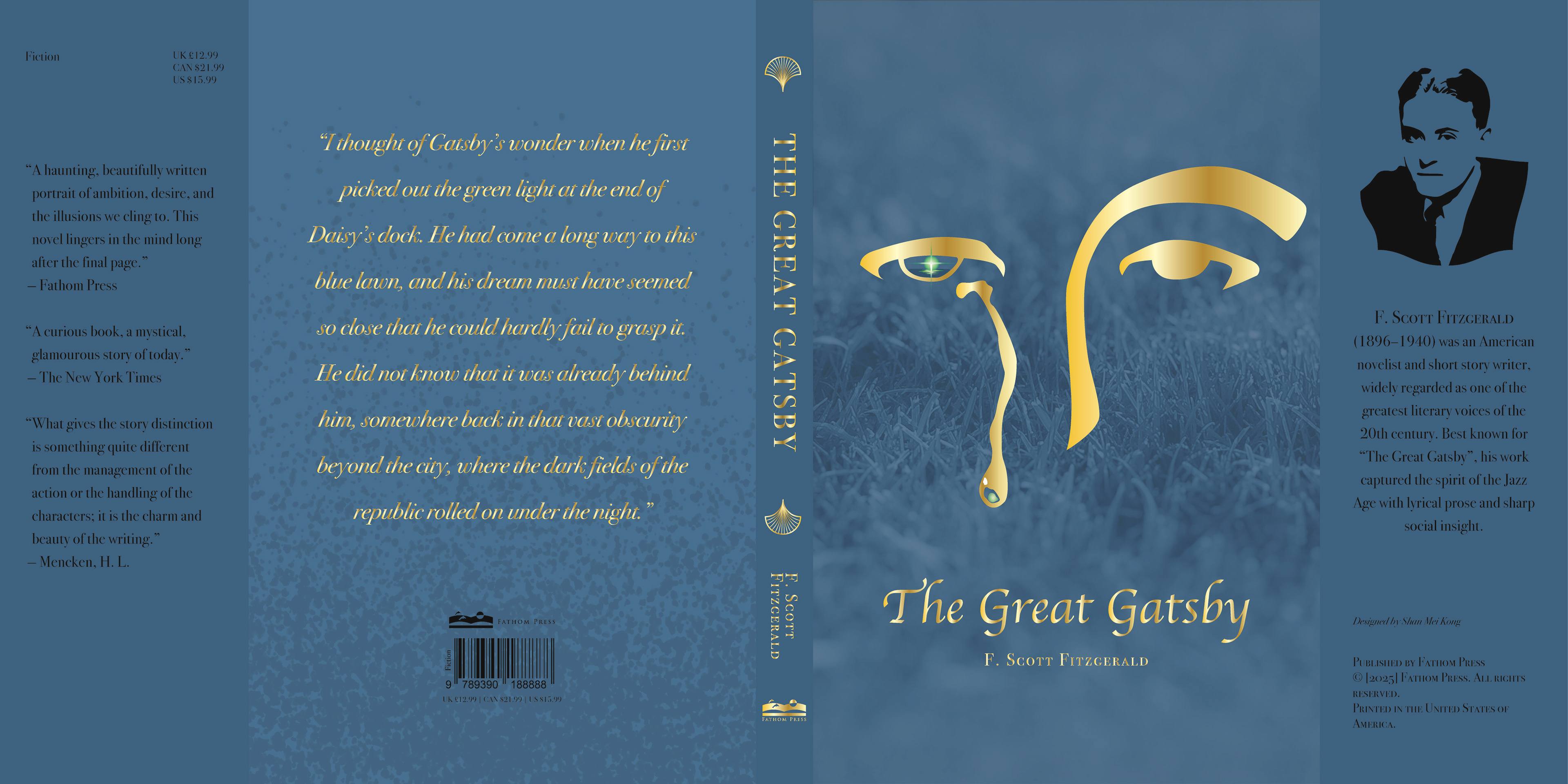
I added a subtle grass texture to the blue background, referencing the “blue lawn” mentioned in the novel and enriching the surface visually.
“I thought of Gatsby’s wonder when he first picked out the green light at the end of Daisy’s dock. He had come a long way to this blue lawn, and his dream must have seemed so close that he could hardly fail to grasp it.” (P.184)
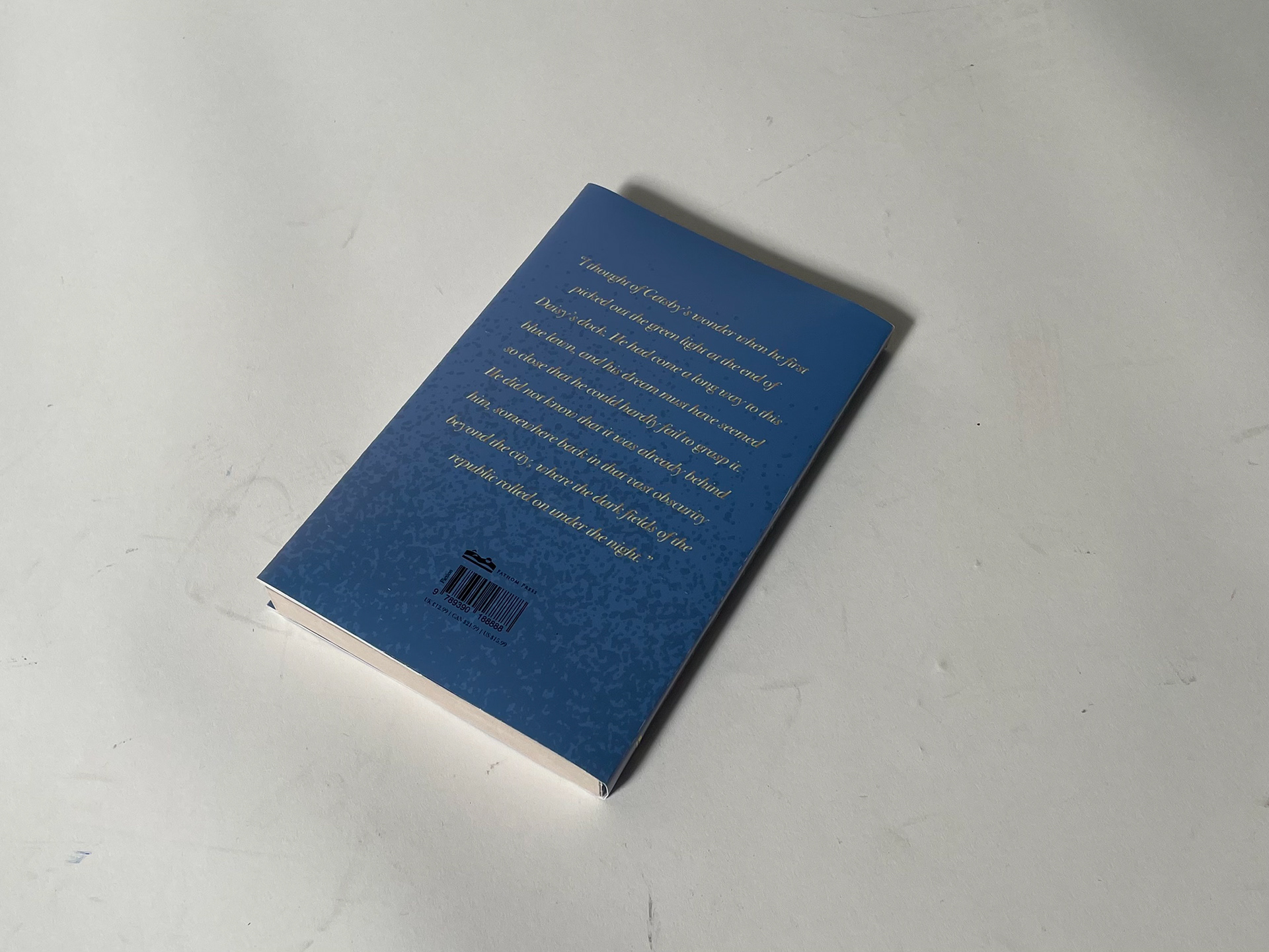
On the back cover, I selected the quote below to highlight the novel’s literary beauty and thematic depth. A darker shade of blue and a scattering of dots suggest the “foul dust” mentioned in the novel in the below quote.
“...it is what preyed on Gatsby, what foul dust floated in the wake of his dreams that temporarily closed out my interest in the abortive sorrows and short-winded elations of men.” (P.14)
My design’s color palette centers on deep blue and gold (a soft gradient of yellows), with a single green of the “green light”, and black used for all remaining elements and text.
In conclusion, my design aims to express the symbolic richness of The Great Gatsby through visual choices, in my best to translate the novel’s atmosphere and themes into a cohesive and meaningful cover and book jacket.