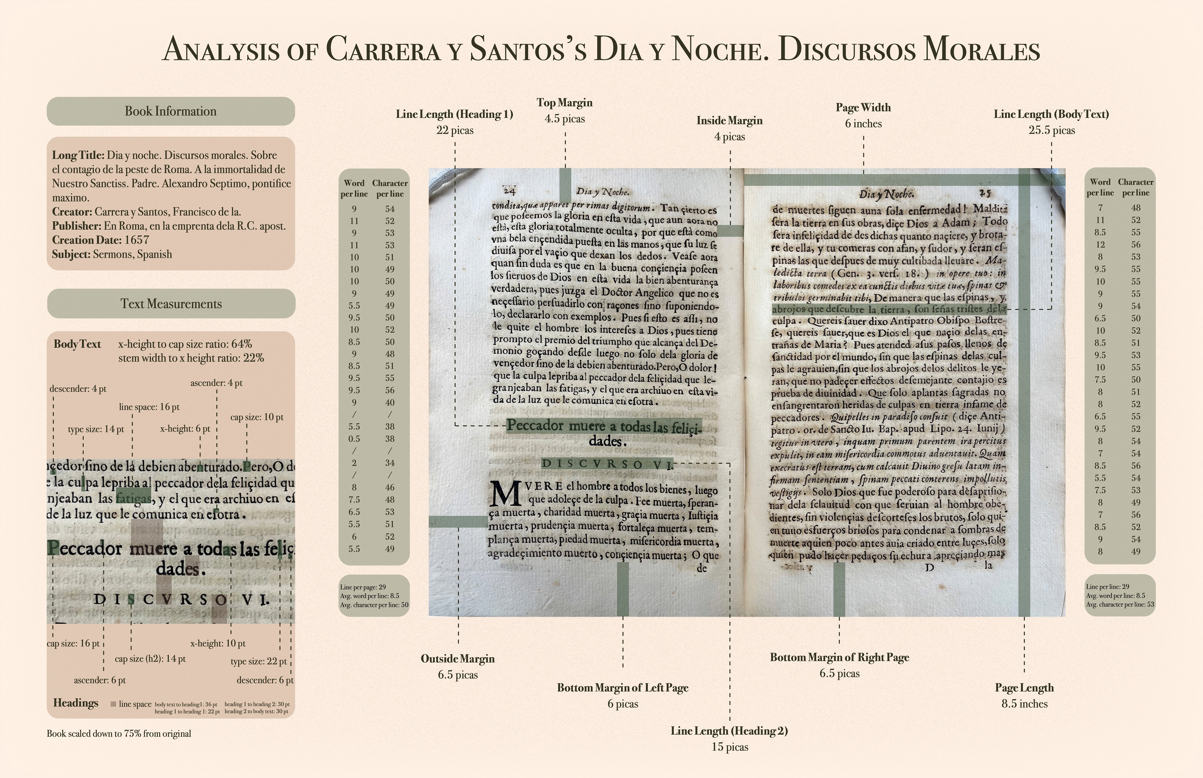
1. Measured type and text frames in an early printed book
2. Visualized the metrics behind the words in a 11” x 17” poster
2. Visualized the metrics behind the words in a 11” x 17” poster
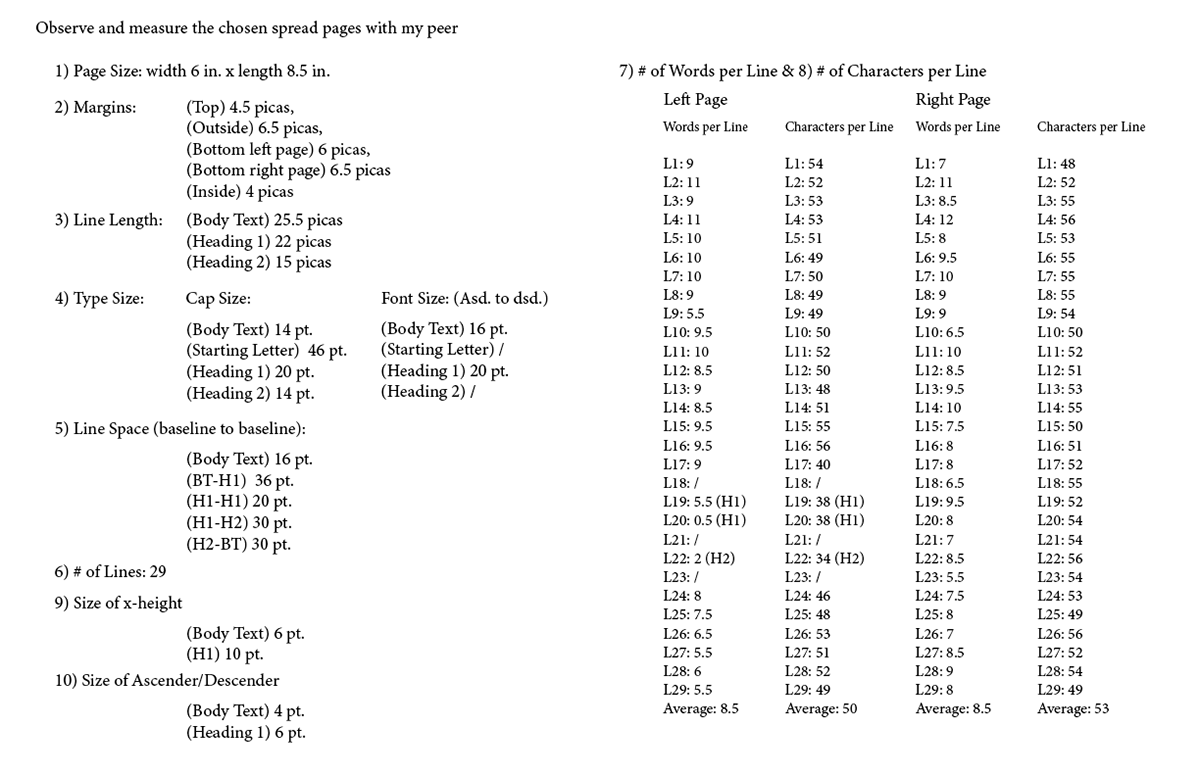
I visited the Special Collections at Binghamton University and selected an early printed book for the project. Through close observation and precise measurement, I collected and recorded key parameters.
The color palette for the poster was derived from the tones of the book’s aged pages. The early printed book carries a vintage quality, with time-worn paper that reflects its age. Inspired by the hue of the pages and printed ink, the final palette features a warm beige and a muted deep green.
I chose Bodoni as the typeface for the poster text. As a classic serif font known for its strong contrast between thick and thin strokes and its elegant, refined structure, Bodoni evokes the historical character of early print design. It complements the tone of the book and helps bring the viewer back to the era in which the book was printed. Its well-crafted small caps were also used effectively for the title.
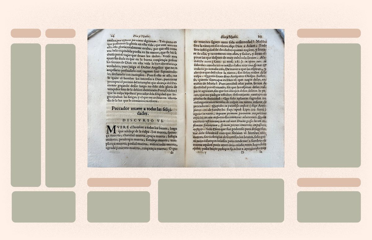
I went through iterations while refining the layout of the poster. With a substantial amount of measurement data to present, each space had to be carefully designed and intentionally assigned to ensure the layout remained informative without feeling overwhelming. The goal was to maintain clarity and balance throughout the composition.
During the critique, I received feedback suggesting that instead of placing the word-per-line columns for both pages on the same side, it would be more effective to position each column next to its corresponding page—that is, the column for the left page on the left side, and the column for the right page on the right. This arrangement allows viewers to more easily associate the word-per-line information with the corresponding page and line, improving clarity and readability.
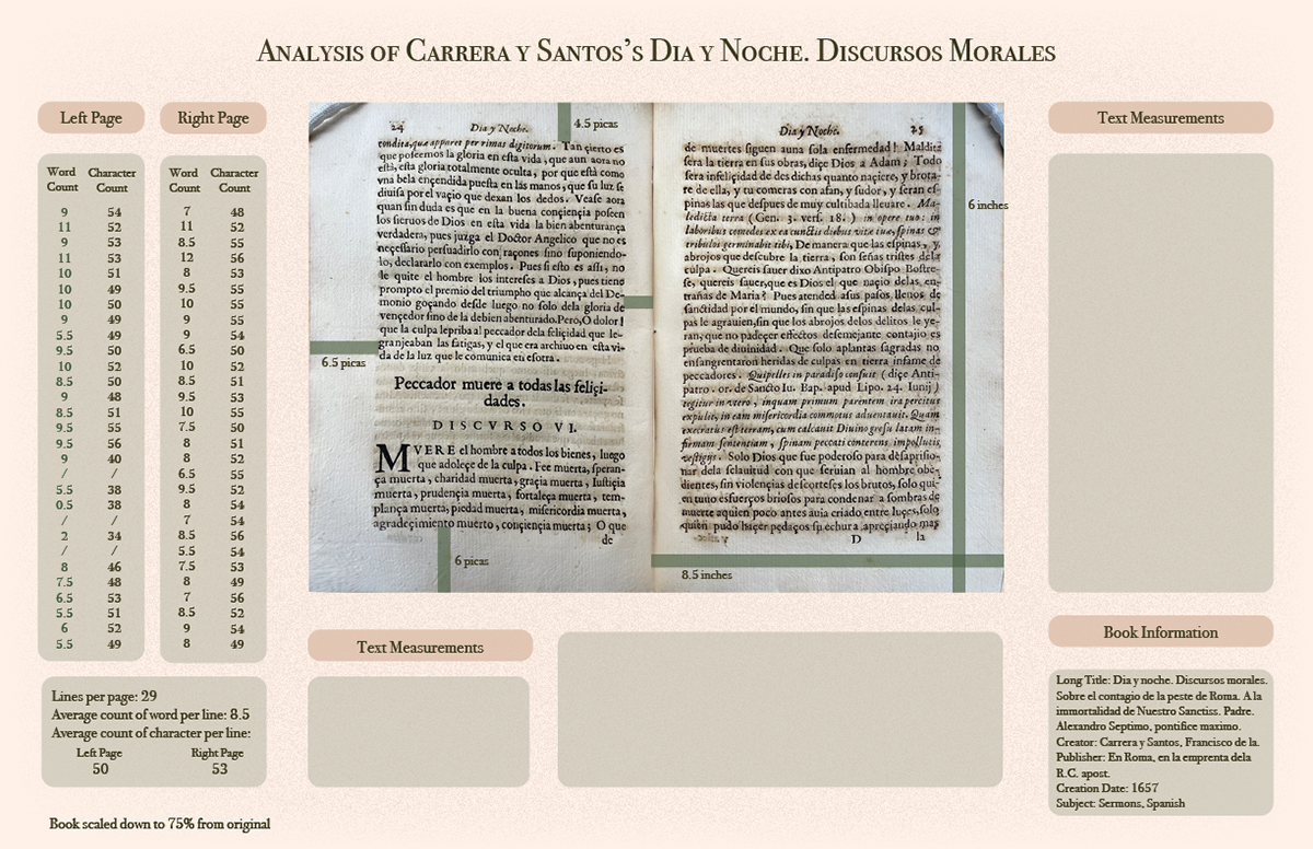
I agree with that arrangement and realized that the book spread cannot remain centered if I want to place the word-per-line columns on either side. If the spread stays in the center—unless scaled down significantly—it, along with the left and right columns, would occupy too much space, leaving little room for the other text sections. To resolve this, I decided to shift the entire spread and its columns to one side, which freed up space on the opposite side for the remaining text, resulting in a more organized and readable layout.
In addition, I rearranged the text to free up more space, allowing the page dimensions to be moved out of their previous overlap with the spread. This adjustment made the measurements clearer, with dotted lines connecting each dimension to the corresponding part of the page.
Overall, the poster appears cleaner and more visually refreshing.